
Ever used an online design discussion board to ask, “What design style is this?” You are probably not alone. Sometimes designers and illustrators have to dabble in an aesthetic style that is completely new to them. After all, the brand chooses the aesthetic Mr Potter. Pardon the Potter parody reference. Imagine you had a menu card of sorts, that sampled a long list of design and illustration styles. You can refer to it when you are stuck with ideas for a design project. You can use it to show your client a range of art styles that will help them envision what they want. Or, you can just learn about new aesthetic styles that come in handy for the future. This post of the top digital design and illustration styles can help you choose the type of visual design you need for your next project.
1 – Comic Book Illustrations
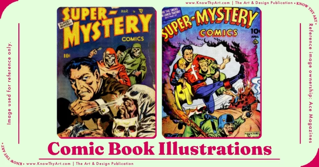
Halftone comic book illustrations, is a style that comes and goes out of the trending section. But, there is no denying its appeal. Every character, element and scene, contributes to creating a vintage vibe that suits many brands. Micro-tip, inky outlines, shadow hatching and solid bright colours with half-tone print are the hallmarks of comic book illustrations. Comic book illustrations can be traced back to the 1800s and they are still here to stay.
2 – Corporate Memphis

If you have social media accounts, it is likely that you have seen these illustrations on company-sponsored advertisements. Corporate Memphis animated characters have distinctly large limbs, faces with soft expressions, clean lines and friendly colours. This purposeful style was started by a media agency called “Buck” for Facebook in 2017. The idea was to have happy and friendly characters divert the audience from the negative perception that large corporations tend to have. “Big, bad corporations” embraced the Corporate Memphis style and soon enough, we saw it everywhere. Corporate Memphis also goes by names like Corporate Minimalist, Flat Art and Blob Web among others.
3 – Linge Claire

Linge Claire means “clear lines.” This illustration technique was made popular by Hergé, the creator of the Tin Tin comics. As the name suggests, this drawing style is characterised by outlines of a single weight. The colouring style is naturalistic with shades and tones that make the scene look realistic even though the characters have a “cartoony” feel.
4 – Rubberhose Retro Mascot

You could thank Miss Minutes from the Loki series for the resurgence in popularity of the Rubberhose Retro Mascot. Wide, glazed eyes, cherry nose, a wide smile and hosepipe limbs on almost any object and voilà, you’ve got yourself a mascot. A basketball or a cup of milkshake, turn anything into a brand mascot. From Felix the Cat to 1930s animation, this illustration style makes characters look lively.
5 – Flat Vector Illustrations
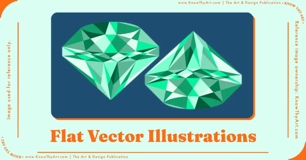
These illustrations have no shadows, no highlights, no gradients and no dimensions. Since there are fewer details, these images are versatile for a wide range of surfaces. Printing them becomes easy not only because they are vector-based images but, also because fewer details equals little room for printing errors. Companies tend to use such illustrations in their branding as they can be printed easily on anything from a letterhead to a shopping bag, with ease. This is one of the most requested design and illustration styles by clients even today.
6 – Anime Illustrations
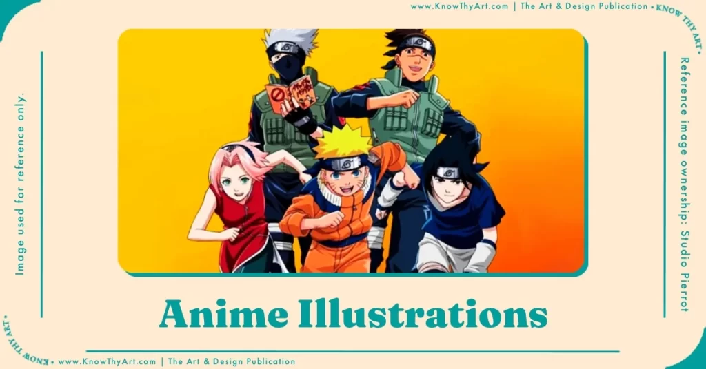
This famous animation and illustration style from Japan needs no introduction. Since the word “Anime” comes from the English word animation, it makes sense that all animation from Japan is called “Anime.” While in the West, the distinct Japanese characters with pointy locks of hair and large eyes, that are mostly produced in Japan are called “Anime.” Series like Naruto, Pokemon and many more have contributed towards making this art style a global phenomenon.
7 – Psychedelic Illustrations

If it’s psychedelic, it’s almost certainly the 1970’s. When flower power, peace signs, VW combis and tie-dye were all the rage, psychedelic illustrations were in the fashion. Brightly coloured ink-bleed patterns that represented the kaleidoscopic visions under a state of trance defined psychedelic illustrations.
8 – 3D Illustrations
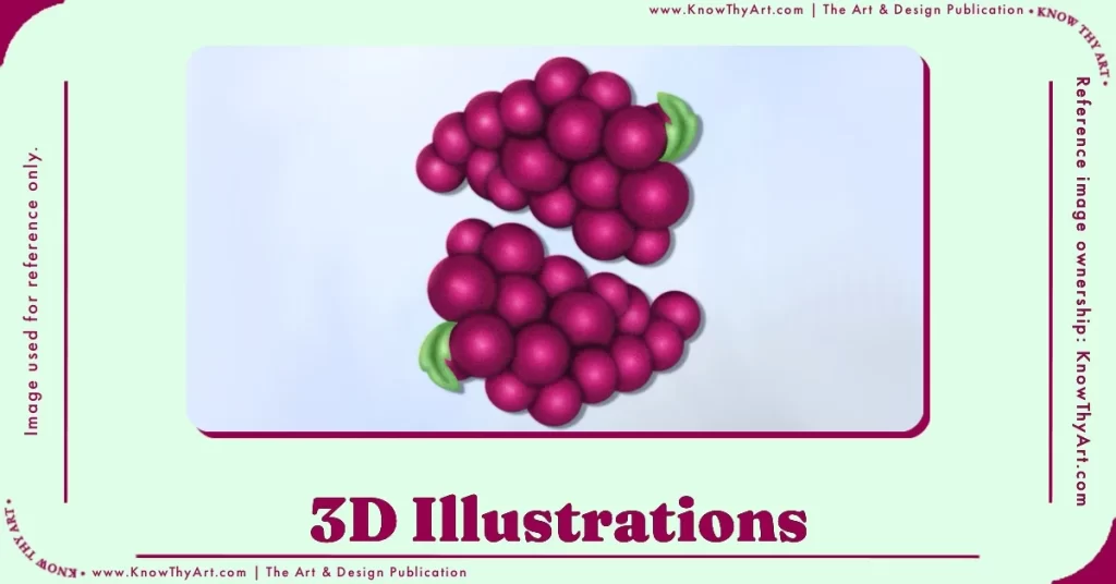
3D illustrations offer viewers a more immersive experience, perfect for moving pictures and animated films. Motion graphics, explainer videos and VR are some popular uses of 3D design. 3D also gives the viewer a tactile feel of the illustrated scene. A squishy shape can be more evocative than a 2D circle even after shading and highlights. It is no surprise that 3-dimensional illustrations became popular again during the pandemic, when people were isolated and kept from having too many sensory experiences.
9 – Bauhaus Illustrations

Walter Gropius began the Bauhaus art movement with the simple belief that in art, there should be no distinction between form and function. This means that if you draw a straight line, it should be because the design project needs you to draw a straight line in that spot. Also, if the design does not require any decorative elements to function, then there should be no decorative elements. This is why you will notice that Bauhaus illustrations will be simple and stick to only what is functional. Bauhaus style can be in architecture, design and even visual arts and illustrations.
10 – Lino Cut Print
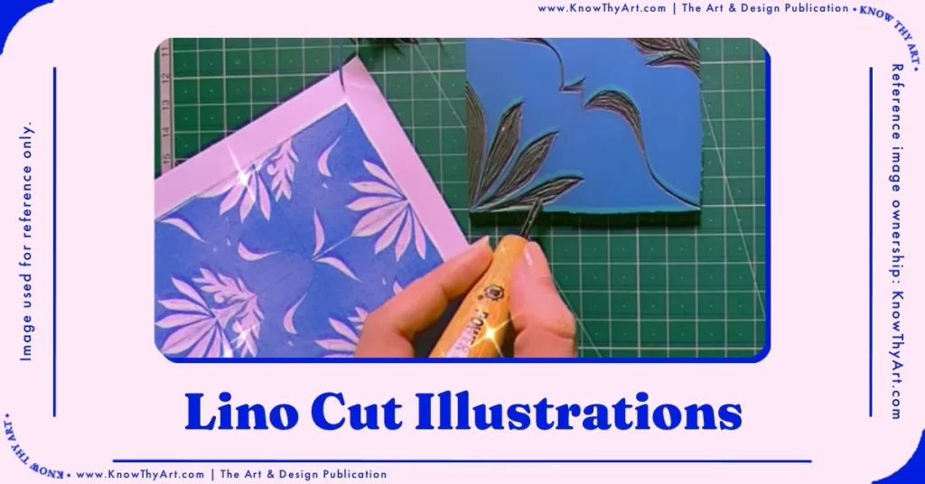
All you’ve got to do is trace out an illustration on a linoleum sheet and carve it out with a lino-cutter. Use a roller to apply the water-based ink and voilà, use it like you would a rubber-stamp or a wooden block printer. Newer techniques of using different colours in stages, forcing a glitch effect and translucent colours make these artworks even more interesting. Lino Cut illustrations are great for designing pattern illustrations by using a linoleum pad as a single tile.
11 – Risograph Overlay Colour

Translucent, shocking fluorescent inks that sometimes overlap to mix colours in an overlay. This is a fair description of a Riso illustration. Risograph printers print one colour at a time. This means the paper has to go into the printer roll again, just so you can add red flowers to the existing green shrub. When the paper goes into the printer multiple times, it can sometimes move slightly off. This makes the overall result have slight imperfections with what looks like a chromatic aberration. These imperfections are why Riso illustrations are so loved, as each one is unique even though it is mass-printed.
These days Riso illustrations are made digitally with bright palettes and an overlay blend mode for the overlapping, colour-mixing effect.
12 – Line Art
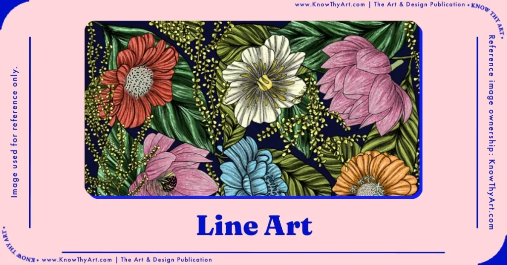
Illustrations with prominent outlines are called Line Art. While Line Art is an umbrella term, there are certainly many categories within this type of illustration. Monoline art mostly has a. consistent thickness of lines. Other types of line art depend on changing thickness with pen pressure, coloured lines, micron lines, brush lines and more. Shapes in Line art are well-defined and illustrations can have more contrast and depth without having to tweak the colours too much.
13 – Block Print

An illustration is traced out and carved on a block of wood or metal and then used as a printing stamp. It is a very straightforward form of printing your illustration on a surface. Illustrations in this style have to compensate for ink spread, blotching and bleeding. This means that designs should have elements that are evenly spaced to allow for blotting. Block printing illustrations work best for abstract or motif renditions as opposed to realistic illustrations that tend to be overcrowded with detail.
14 – Cartouche Logo
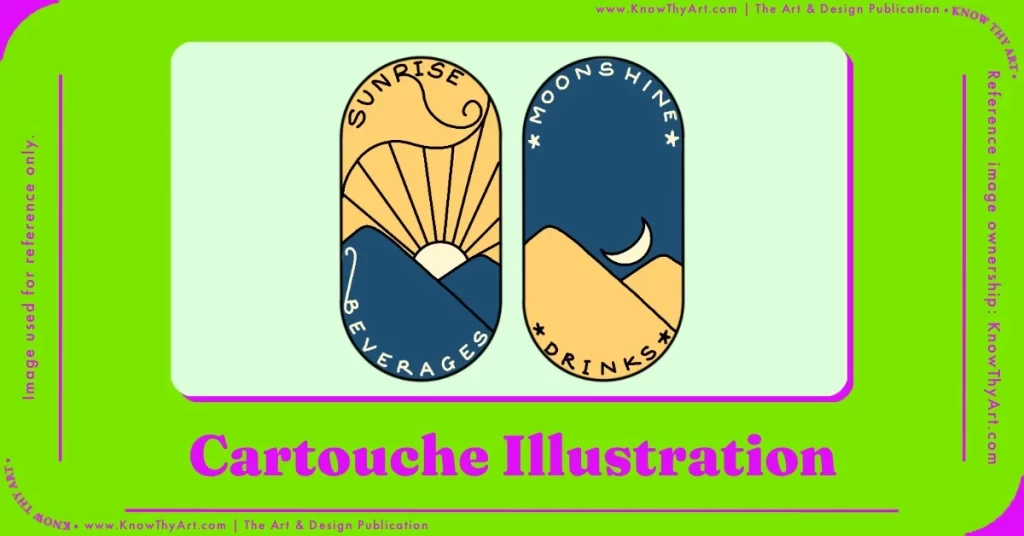
Based on the ancient Egyptian Cartouche shape that resembled a pill with a line in tangent at the base, Cartouche logo illustrations bear the same shape. Composed within this pill shape with an abstract illustration of the brand emblem nestled inside, the cartouche capsule is quite a popular logo style. A neat style of illustration that contains the necessary drawing within a compact shape.
15 – Brutalism and Neubrutalism
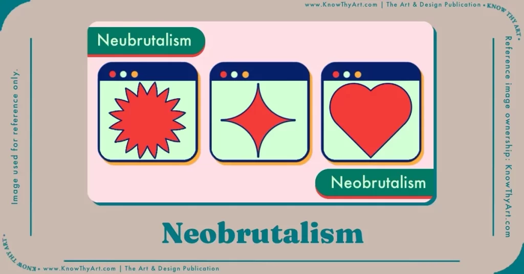
Architects like Le Corbusier and Louis Kahn popularised the Brutalist style. These buildings were characterised by a raw appearance of exposed concrete walls, basic window shapes, sharp angles and bare of any embellishments. This architectural style was meant to save money in a post-war economy in Europe where only necessary structural elements were used. Brutalism in design and illustration uses just the bare necessary elements and the design almost looks “unfinished” or like a draft of the final design. The difference between Brutalism and Neo-Brutalism is the introduction of “attention-grabbing” colours, rounder edges, hard shadows and a few design embellishments in the latter.
16 – Vaporwave
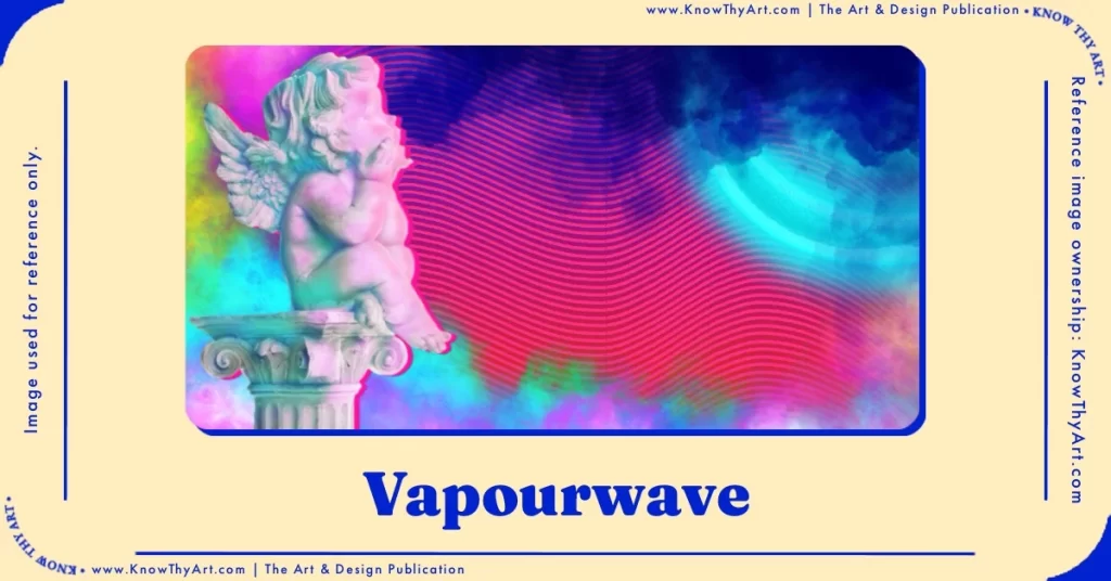
While Vaporwave is a genre of electronic music, the loud electric colours and fluorescent gradient maps translated well to graphic imagery in the 2010s. Essentially, this visual language looks like it is straight out of a Tron movie with a totally contrasting retro yet futuristic vibe. Scenes of Vaporwave designs typically look like a “Cyberpunk” world with perspective grid floors, glitchy clouds, neon trees and the lot.
17 – Superflat Pop

Take an illustration of a flower, remove the shadows, erase the highlights, minimise gradients and light variation and voilà! You now have an image of a flower with no dimensions, in other words – Flat. Japanese artist Takashi Murakami’s style of using vivid colour language on such flat illustrations gave rise to the Superflat Pop design aesthetic. From the mid-1990s onwards Murakami’s flattened forms have gained popularity in the art scene.
18 – Memphis Pattern Design (Neo-Memphis)
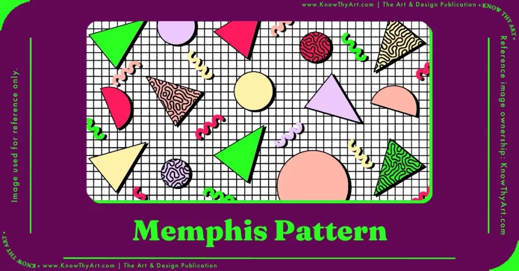
If Art-deco and Pop Art were to have a child, it would be the Memphis Pattern Design. Art-deco’s geometric compositions with the playfulness of Pop Art made this style look like a playful expression of “Geometric-pop” (for lack of a better term). The 80s and 90s generations will remember having these patterns even on T-shirts and bedsheets.
19 – Pixel Art Illustrations

Computer and mobile screens were pixelated in the 80s and 90s because LCD and AMOLED were not yet in every household. As a result, buttons, icons, images and text were heavily pixelated. Somehow even circles had multiple angles! While the need for pixel images is no more, the love for the aesthetic persists. 8-bit and 16-bit images still have visual appeal and the artworks of talented Pixel Art illustrators still have takers.
20 – Isometric Illustrations

Isometric illustrations are drawn on a perspective grid. This gives the viewer the feeling that they are “looking over” the illustrated scene. This style can accommodate wide landscapes and heavy details. Most illustration software have assisted isometric grids on which it becomes easier to draw your sketch. Currently, Isometric is one of the most trending design and illustration styles.
21 – Paperback Chic
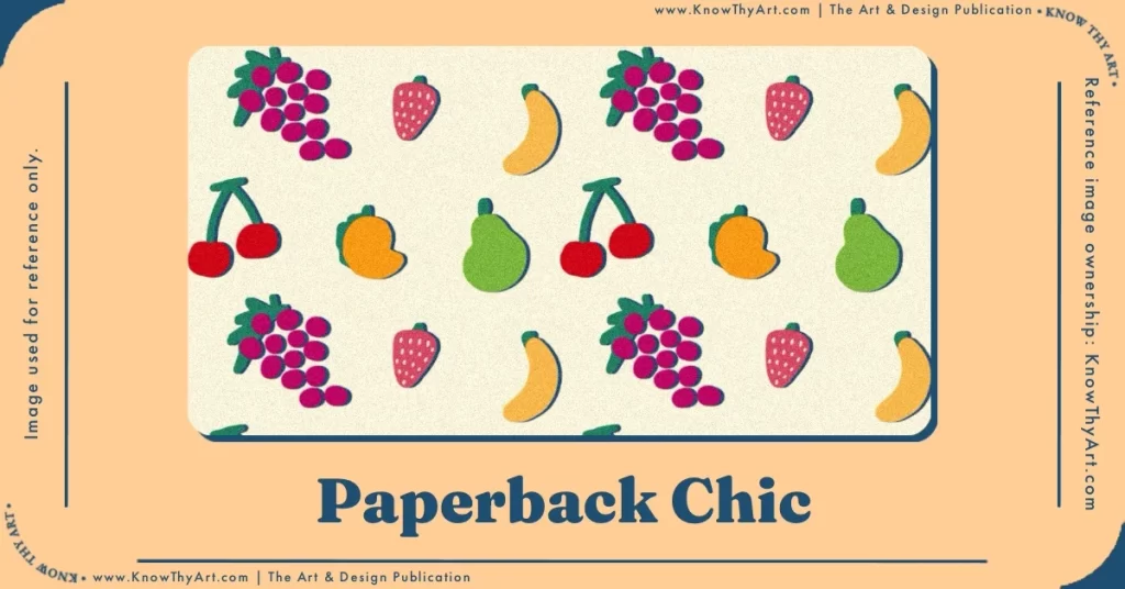
No outlines, flat colour fills, no shadow work, squiggly lines, motif illustrations that are generally on mild-coloured backgrounds. A great aesthetic for matte finish surfaces like the Chobani yogurt packaging designed by Will Mac. “Chobanicore” or the Paperback Chic design aesthetic even graces the new Olipop Sparkling Tonic cans designed by Break Maiden Agency. Paperback Chic manages to be both, abstract and fun while remaining palatable for a wide audience. Paperback Chic is among the versatile design and illustration styles for commercial projects.
22 – Mid-century Modern

If you want your next visual design project to have “The Jetsons” aesthetic, you’re probably thinking about Mid-century Modern design. With a popularity spanning from the 1940s to the 70s in interior design, the Mid-century Modern design adapts well to both decor, graphic art and even UI design. This style, also called “atomic design,” is reminiscent of 1950s Hollywood glamour with flat starry shapes, quirky serifs on fonts, bright colours that were slightly desaturated, bold shapes and iconography of that decade.
23 – Corporate Grunge

Corporate Grunge is characterised by rusty colours, grungy textures, clipart icons and late 1990s Microsoft Powerpoint fonts. Such a design aesthetic today, is likely to make someone with no knowledge of design cringe like an over-ripe tomato, one could only imagine how Corporate grunge makes professional designers squirm. But oh well, to each their own.
24 – Wimmelbilderbuch Illustrations
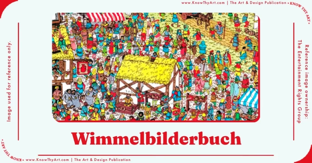
The word “Wimmelbilderbuch” in German means “teeming picture book.” Needless to say, such illustrations are described as being swarmed with details. To be able to fit more details, the elements themselves are tiny but the overall landscape is generally larger than life, or double-spread, whichever is in the budget. The classic “Where’s Waldo” is a good example of the Wimmelbilderbuch illustration style. Nowadays, Wimmelbook illustrations are even drawn isometrically which enables viewers to scan and squint over every block of detail on each grid.
25 – Art Deco Illustrations
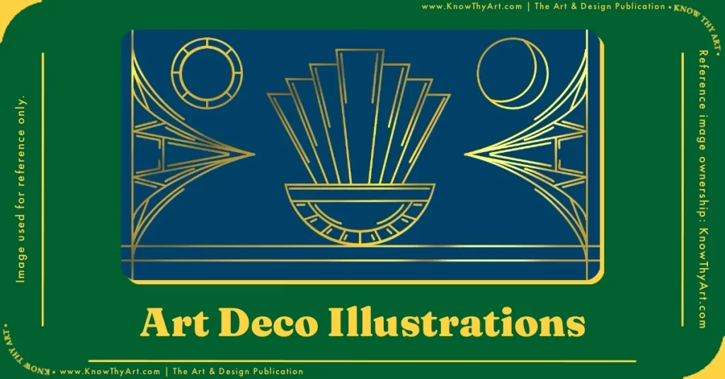
Art Deco is a visual style that employs geometric lines and curves quite seamlessly. Popularised during the roaring 20s in America, Art Deco can be employed for architecture, metal artwork, graphic designs and even illustrations. The distinct rich colours with gold embellishments work brilliantly for spot-UV illustrations.
26 – Utopian Scholastic
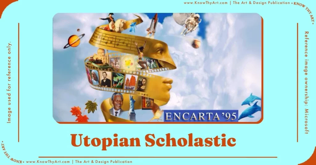
If you owned an Encyclopaedia in the late 90s or early 2000s, the design on the book cover was probably Utopian Scholastic. Newton’s apple, an astronaut, Albert Einstein and a dinosaur flying out of a human’s head and all seen through a magnifying glass. Even Window’s CD ROMS with educational content had such album covers. Utopian Scholastic still is wholesome narrative art for textbook covers and the like. However, this is arguably one of those outdated design and illustration styles.
27 – Pen and Ink Illustrations

Pen and ink illustrations are a classic style that can be achieved with micron inks, reeds, ink pens and the sort. This is used by comic book illustrators, political cartoonists, canvas sketching and more. This type of illustration can range from simplistic, to stylistic and even be detailed with cross-hatching, ink-filled shadows etc. Pen and ink illustrations are quick and handy for concept art, storyboards and drafting.
28 – Scientific Illustrations

Since scientific illustrations are textbook drawings that are used with reference to the adjoining text, it is supposed to be detailed. For instance, if a text covers details about the heart and cardiology, it would be essential to ensure that all the veins and aortic chambers are illustrated most accurately. This is because explanations in the text and the readers’ understanding will depend on the visuals. Artists who dabble in realism and realistic illustrations are generally good with scientific illustrations.
29 – Collage Art
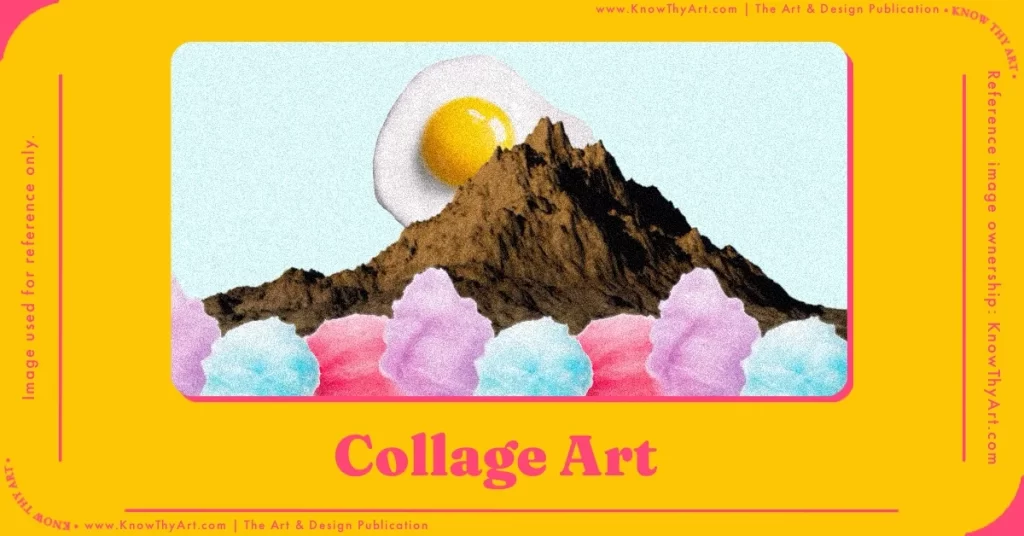
In this art style, you must draw every element separately as spot illustrations by making them look like cut-outs or stickers. You then bring them together in a single composition. Collage art can be made either by illustrations or even a mix of photograph cut-outs to work as a mixed-media piece.
30 – Typography Illustrations

Stretch, squeeze, twist, wave or cut. Basically, typography is moulded artistically to achieve a particular visual aesthetic. With these illustrations, shapes and elements are formed using letters. The overall result is also likely to have a meaning or message embedded in its purposeful shape and distortion. Such illustrations are mostly used for logos. Type Art design and illustration styles vary depending on the individual artist.
31 – Paper Cutout Illustrations
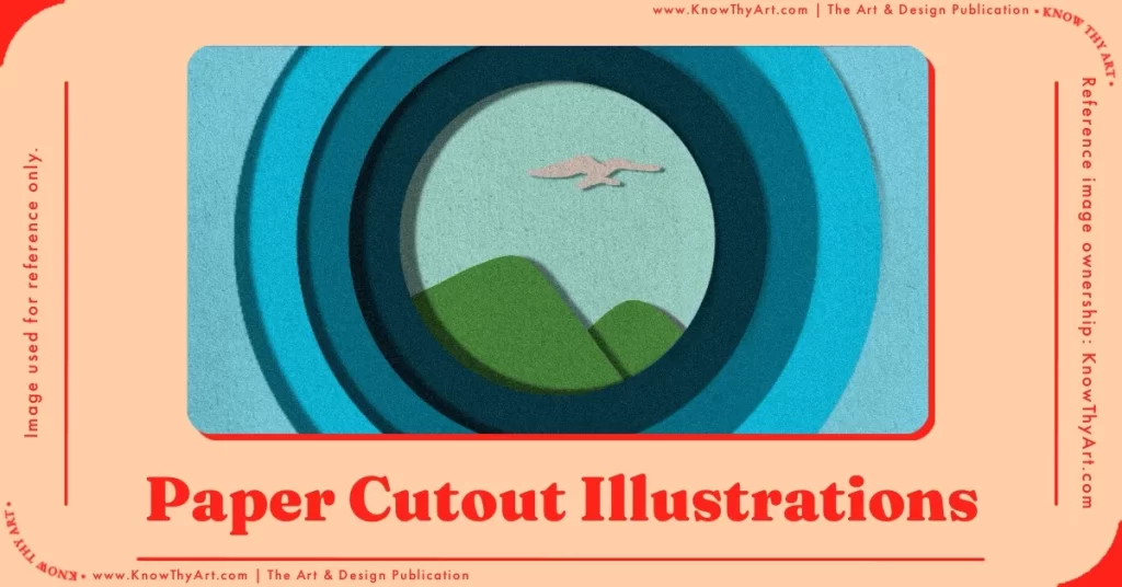
Thanks to paper texture brushes on Procreate and the good ol’ multiply blend mode, digital artists have flooded Instagram reels with paper cutout illustrations. And I’m not complaining. The process is satisfying to watch and the outcome is a very crafty-looking illustration.
32 – Pattern Motif Illustrations
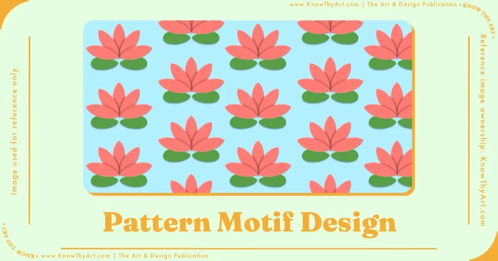
Abstract curves, geometric lines and simplified shapes are used to represent objects in pattern motif illustrations. For example, an illustration of a rose must not be realistic but, rather more like a representation of a rose. Pattern motif illustrations have fewer details and a good use of negative space. This gives the elements “breathing space” and makes it easy on the eyes.
33 – Swiss Design

Based on the International Typographic Style and Modernism, the Swiss Design Style spread across the globe with each region adding its own flair. This is perhaps why the Swiss Style is tricky to define. Some of the characteristics of Swiss Design are that it follows an unconventional modular grid system, modern layouts, sans serif fonts and colours that pop. Presenting design and copy in a simple paragraph format is not something the Swiss style adheres to. There is a sense of movement in these unusual grids which is why Swiss Design works well in motion graphics. This is among the best design and illustration styles if you ever need to design a poster with many focus words.
34 – Woodstock
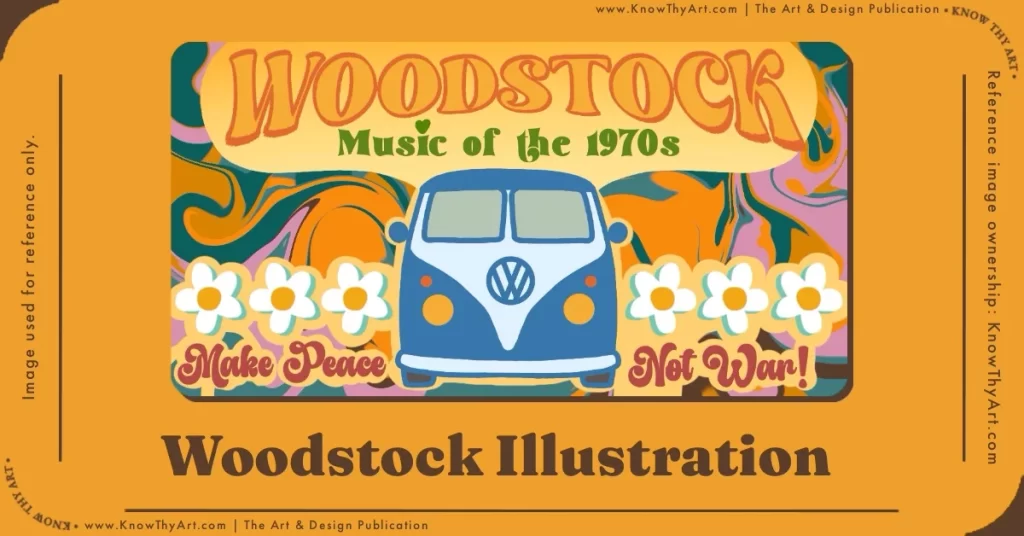
The Woodstock Music and Art Fair was first held in Bethel, New York in 1969. From the year, you can probably guess that the Woodstock visual language would be dominated by the hippie culture and its trends. From music to elements of design like the peace sign, autumn colours and groovy fonts, the Woodstock style translates well to illustrations too. Weighted line drawings with complementary colours and a tad desaturation to capture the feel of 70s prints are a few characteristics of Woodstock illustrations.
35 – Nostalgia Illustrations (80s, 90s, 2000s)

Based on iconography, computer graphics, colours and trends of the decade, nostalgia illustrations have their own vibe and character.
Neons, arcade games and grunge were popular in the 1980s. Therefore 80s nostalgia illustrations have these thematic elements.
In the 1990s bright, primary and secondary colours in line-art became popular.
The 2000s saw a surge in “futuristic” Y2K styles with hot-pinks, holographs and vivid blues.
When you make themed illustrations using these elements, colours and styles, it is known as nostalgia illustrations.
36 – Studio Ghibli

Realistic watercolour scenes with heavy details which speak of the charm of provincial scenes. Even the characters have soft bright colours ambient highlights and shadow work. If you love old storybook sceneries painted in watercolours, it is likely that you would love to pause a Studio Ghibli film every now and then just to admire the frames. While these illustrations are not just limited to Studio Ghibli, they certainly made this illustration aesthetic popular.
37 – UPA style (United Productions of America)

These Mid-century 2D cartoons had a flat, abstract look. There was little to no regard for highlights or shadows. The strong outlines of these figures were filled in with colours that popped, even if the character’s surroundings were dark and dreary. This style was a departure from realistic figures in animated illustrations, the UPA style heavily influenced an entire generation of animated content. You will find this design and illustration style used through the 1940s and 50s in Hollywood productions.
38 – Austurbane

Minimalist, elegant, luxe, chic and slightly glamorous without intending to be so is how one might define Austurbane. Not to mention, the star of the Austurbane aesthetic is the variety of modern fonts. These are mostly serif fonts that are elegant with ligaments given a “liquify” push for novelty. For brands that sell luxurious products, Austurbane is all the rage.
39 – Acidgrafix
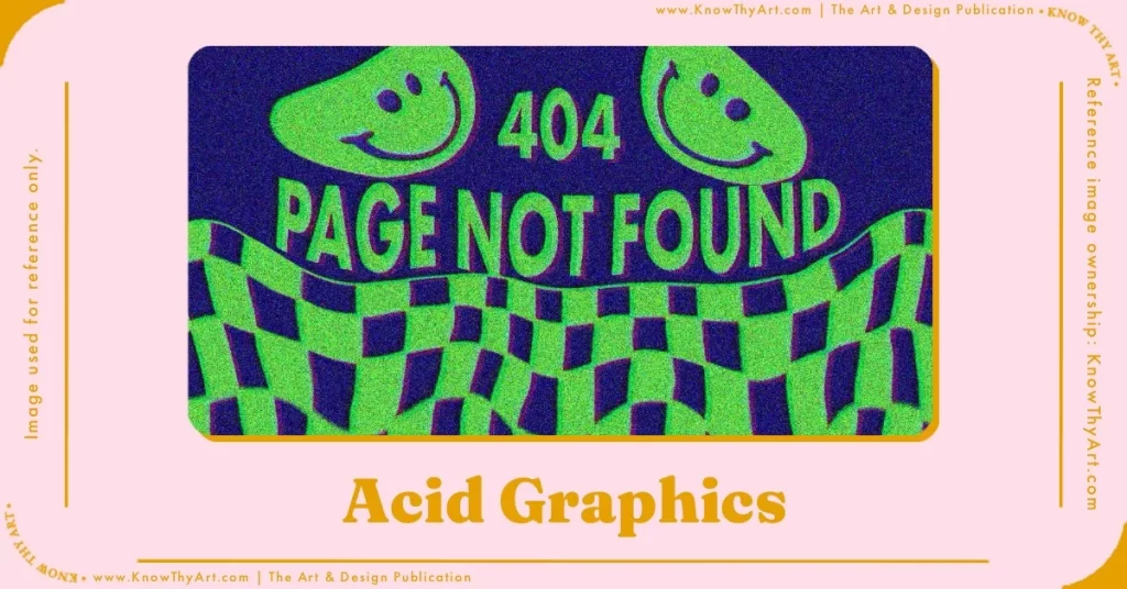
Acisgrafix is a new-age design aesthetic that also identifies as “Instagram-grunge.” This illustration and design style bends every possible design rule and aesthetic boundary. The Acidgrafix design language is so focused on bending the rules, it doesn’t even spell “graphics” right. Although for sticklers who prefer calling it “Acid Graphics,” the style is an amalgamation of elements taken from other styles like retro, grunge, brutalism, psychedelic and more. Surely it is one of those design and illustration styles that is hard to define.
40 – Cyberpunk

Just like Vapourware, even Cyberpunk illustrations seem like a page out of the Tron films. Hot pinks, electric blues, shocking yellows or basically, any colour that hurts your eye would work beautifully in a cyberpunk illustration. In Cyberpunk the shadows are likely solid with elements like pin-light, heavy contrast, punky characters with shocking font colours on dark backgrounds.
Bookmark this post as it will be updated with more design and illustration styles in the future. If you have any suggestions to add to the list, let us know in the comments below.


0 Comments