
Discover the history, principles, and characteristics of Brutalism and Neo brutalism in design. Learn how to create stunning designs using these styles and understand their impact on modern architecture, graphic design, fashion and more.
What is Brutalism?
To learn brutalism and neo brutalism in design we must understand its beginnings in architecture. The Brutalist architectural movement originated in the mid-20th century, particularly in the 1950s and 1960s. It is characterised by its rough, unpolished, and raw appearance. Brutalist architecture often features large concrete structures with exposed surfaces and minimal decoration. The style was popularised by architects such as Le Corbusier and Louis Kahn. They favoured the use of concrete, glass and metal as a building material. In graphic design, this translates to the use of large blocks of colour and typography. These buildings often had minimal decoration or embellishment. Just like a brutalist building looks unfinished, brutalist design should look like a draft without too much finishing.
What is the meaning of Brutalism and Neo brutalism design styles?
The essence of Brutalist architecture must be found in Brutalist and Neo-brutalist or Neu-brutalist design. Just like Brutalist architecture was about using the bare minimum without unnecessary decoration, so is Brutalism in graphic design. This means deleting unnecessary elements, simple fonts with sharp edges and blocky ligaments like the buildings and an overall unfinished look.
If a normal design style aims to be aesthetically pleasing then Brutalism is one that does not conform to this notion. Only what is necessary should make it to the final design and not what is ornamental.
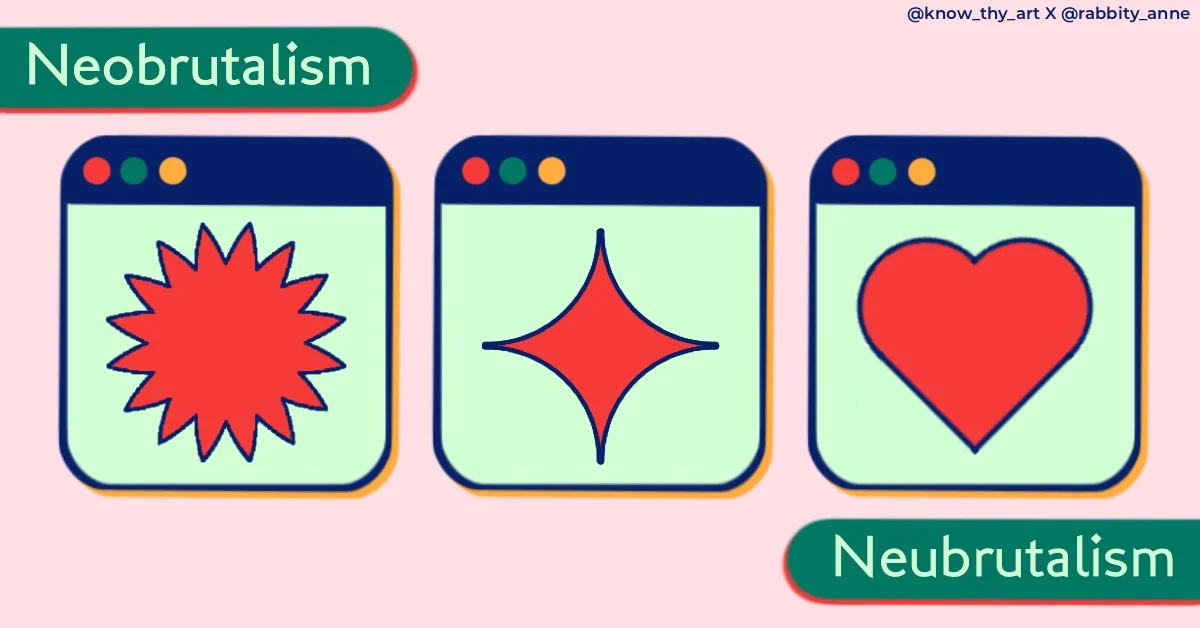
Brutalism Vs Neo Brutalism in Graphic Design
Brutalism: Fonts and elements with chunky weights, sharp edges and palettes with black, white, grey or just one more colour for pop. Popular style for posters, graphic arts and social media advertisements.
Neo-brutalism: Still using the bare minimum but with rounder corners, softer colours, block shadows and thick borders. Popular in UI for web and app design.
Similarities in Brutalism and Neo-brutalism: Both styles avoid using highlights, shadows and shading. Colour palettes should not have more than 3 or 4 colours, the less the better. Straightforward fonts that have less novelty and decoration should be used in brutalism and neu-brutalism.
What are the Colour Palettes or Colour Schemes in Brutalism Graphic Design?
In Brutalist Architecture, Buildings were left unpainted and looked grey from the concrete and building material that was used. Similarly, in Brutalist graphic design, there is the use of a lot of grey undertones, black and white. To make the images and elements pop, one or two loud colours are used at the most.
What are the Design Elements in Brutalism Graphic Design?
When you draft a poster, you tend to put placeholders in place of where the final elements would go. For example, you would press “cmd 8” or “ctrl 8” to evoke the asterisk sign in place of where the “rose” would go. Place an upward arrow where the “rocket” would go or a hashtag. This means that you would use simple keyboard elements in the draft stage just to get an idea of the layout.
However, since Brutalist design is meant to look like the draft and not the finished product, these ready-to-use keyboard elements are actually what would go in your final design. This makes Brutalism a hassle-free aesthetic in a way that you must use the simple elements that get the job done.
What are the Font Styles in Brutalism Graphic Design?
Just like you use the readily available elements for design like the asterisk, hashtag, arrows and other symbols that are preinstalled, the same goes with fonts. Ariel, Helvetica, Times New Roman and Calibri are some of the popular fonts in Brutalism. Basically, you must use the same fonts that you would when making the draft with placeholder text. Furthermore, the text is rarely stylised with colours, gradients or other effects. Simply design a draft and leave it as it is.
What art the Backgrounds and Textures in Brutalist Graphic Design?
Brutalism tends to use desaturated elements and images with a slight grunge texture to them. Sometimes, even the use of noise goes well with brutalist designs. Backgrounds tend to be plain with less or no texture.
What is the Layout Style in Brutalist Graphic Design?
The placement of images and words in brutalist posters tends to have no uniform structure. When drafting a design, you tend to play around with the size and positioning of the elements. At this time, the text and elements look out of place without a neat grid. This is essentially how the final outcome of layout in Brutalism design must look.
What is the Creative Industry Application of Brutalism Design?
The design sectors that have openly accepted and loved brutalism design are UI, Graphic Design, Branding, Advertisement and even Fashion Design to some extent. The brutalist design style has a funky and bold feel. Because of this, brands that cater to young audiences love using it in their products and advertisements.
By understanding the principles and characteristics of Brutalism and Neo brutalism, you can create stunning designs. Create projects in the Brutalism and Neo brutalism design movements and explore the impact of these design styles on modern architecture and digital design.


0 Comments