
In ‘Designing Dark Mode User Interface’ we will learn the purpose of using a dark mode user interface. Also, we will explore how to design dark mode UI by properly considering UX.
Dark mode user interface design is gaining immense popularity, and there are plenty of inspiring examples to explore. From sleek dark mode UI examples in popular applications like Sims 4 to the subtleties of dark mode UI colour palettes, designers are diving into this trend headfirst. Many turn to dark mode colour palette generators and resources to discover the perfect shades, with dark mode colour codes and hex values becoming essential tools. These design elements offer both visual appeal and reduced eye strain, making dark mode a versatile and user-friendly choice in contemporary design.
What is Dark Mode Design in UI?
The Dark Mode Design UI is a feature that is offered by iOS, Windows, Google and Android. Most apps also have their own dark mode feature. Using a simple toggle switch, the bright, white areas of the interface displayed will turn dark grey or black.
To become good at designing dark mode interfaces, we must first understand why people use the dark mode on their phones, tablets and laptops. Once we understand the consumer’s behaviour with dark mode screens, we can easily determine what rules of design and optics we need to apply. In this way, the right kind of design will accomplish the exact goal for which it is made.
Why is Dark Mode Design UI used?
Because of the glare from an extremely bright, white screen, dark mode design UI is used to avoid hurting the eye too much. This means that the primary purpose of the dark mode user interface is not really to offer an extra aesthetic option but rather to please the eyes and brain. This is done by darkening screen glare around bright areas.
To understand the importance of Dark Mode UI, we must understand how screen glare affects the eye. Firstly, when there is less light around us, our pupils open up more or dilate so they can absorb more light so you can see better. Conversely, when it is too bright, the pupils in your eye contract to avoid taking in too much light. This excess light is called “glare.”
Keeping this basic scientific detail in mind, we can imagine how bad a cinema hall is for our eyes. This is because the pupils in our eyes are totally confused. Our pupils don’t know if it needs to open wider in the darkroom or if it should close up from the bright cinema screen. This is why sitting in a cinema all day might just give you a headache.
How does Dark Mode Design UI work?
iOS, Android, Windows and Google have now made the toggle switch to turn the dark mode design on and off easily accessible from the home screen. The reason for doing this is that the UI designers and developers have realised that people prefer to quickly switch to dark mode on their screen the moment it gets dark or they are in a low-light area.
Remember how your eyes are confused in a cinema? Similarly, in low light or at night, your eyes and brain prefer if the light from your screen is not an extreme contrast to the surroundings.
How to make a good Dark Mode Design UI?
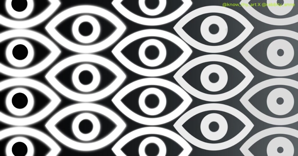
Creatively cut the glare! Yes, it is that simple. Imagine a white dot on a black surface. The white dot emanates light that stands out on a pitch-black background. This is glare. To cut the glare in Dark Mode Design, we simply need to learn how to gauge contrast. Also, we must use greys and off-white shades to our advantage.
Now that you have understood how the eye prefers dark mode design in dimly lit areas, let us dive into how we can design practical designs. These designs must be pleasing to the eye, quite literally.
How to use basic colours in Dark Mode Design UI?
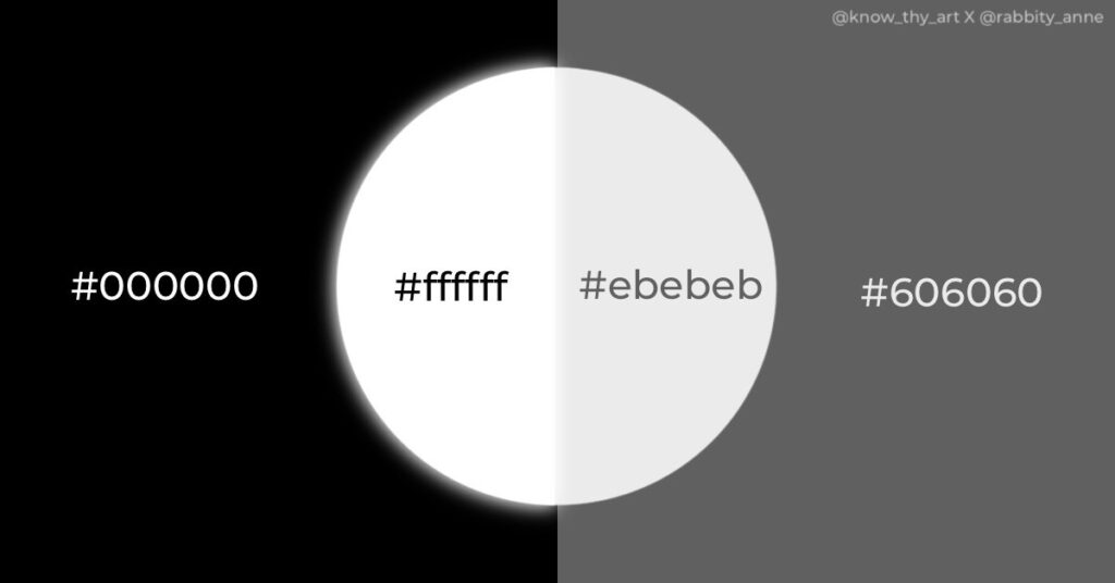
In dark mode design, the use of #000000 black and the use of #ffffff white is not a good idea. Instead of using pitch-black and pure white, you could use a dark grey like #606060 and a light greyish-white like #ebebeb. With these colours, there won’t be extreme brightness from the light colour causing glare. Also, even if there is a slight glare, the dark grey will not make the light pop as much as it would on pitch-black.
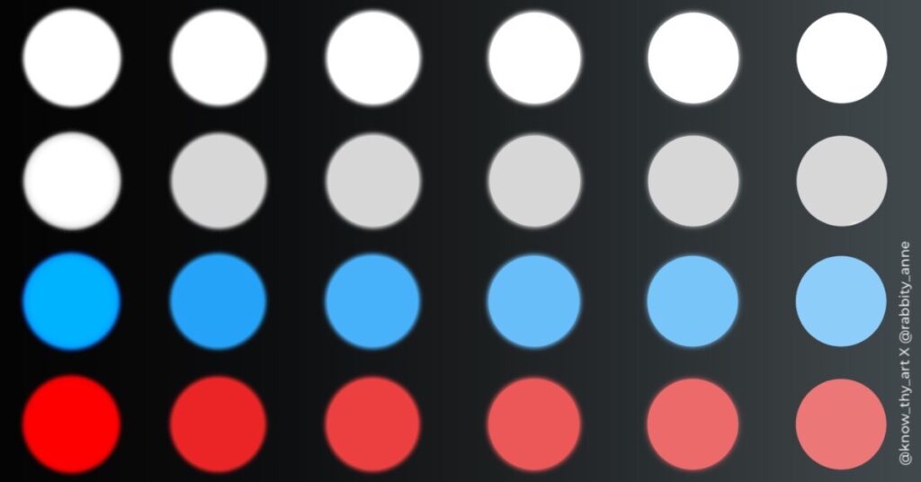
A professional UI designer will generally have a palette of dark greys and light neutral colours at the ready in their design app. Along with this, they will have a palette of slightly tinted colours to make their designs colourful. For example, instead of using a bright blue, tint the blue with a dash of grey. This will make it less bright and kinder to the eyes. Conversely, loud neon colours would be a “no-no.”
How to choose the right font in Dark Mode Design UI?

Now that you have understood the effect of light colours on dark backgrounds, understanding how to choose a font will be easy.
Did you know that in some applications, when you turn on dark mode, the text is programmed to immediately change to a lower font weight? This is because the glow from the glare causes the white characters to look bigger than they are. This is called halation. To overcome this problem, we can compensate by reducing the font weight by 1 or 2 points. Although, the exact measure depends on the font style and the text portion.
How to choose images and icons for dark mode design UI?

Imagine you stare at a light bulb for a while and then close your eyes tight. An imprint of light from the lightbulb still lingers in your eye even though you are no longer looking at it. This, in a way, is like retro-reflectivity. This is another thing that a designer must aim to avoid with dark-mode design. To do this. The icons, buttons and images chosen for dark mode design should be sober.

Images should be edited to have a slight grey tint. This will help. make it easier on the eye in dark mode. Shadows and highlights can add depth and dimension to a dark UI. However, the shadows need to be subtle and the highlights should not be too loud. Remember a lit-up screen in a low-lit area is already glaring on the eye. The lighting on the images and elements should not be too heavy.
Remember User Experience when designing Dark Mode User Interface
When designing a dark UI, it’s important to consider the UX. The dark mode is not just about aesthetics – it’s about creating an experience that is easy on the eyes and enhances usability. It’s important to consider factors such as font size, spacing, and contrast to ensure that the UI is easy to read and navigate. When in doubt, follow Gestalt’s Principles of Design.
Designing dark mode user interface requires attention to detail and a focus on contrast, colour, typography, shadows, and highlights. By following the tips and tricks of dark mode design for beginners, you can create a dark UI that is both aesthetically pleasing and easy to use. Remember to test your design and consider the UX and accessibility to ensure the UI is comprehensible to all users.


0 Comments