
Colour is a fundamental aspect of art. It is no different in digital art and design. A good understanding of colour theory will help you create impactful work with a guide to using colour effectively in digital art. This guide to colour theory and its application in digital art and design covers the basics of colour theory and provides tips for using palettes correctly in your artwork.
What is Colour Theory?
Colour theory is the study of how colours interact with each other and how they can be used to create visually appealing compositions. The most basic aspects of Colour Theory include the colour wheel, colour harmony, and colour temperature.
Colour Wheel
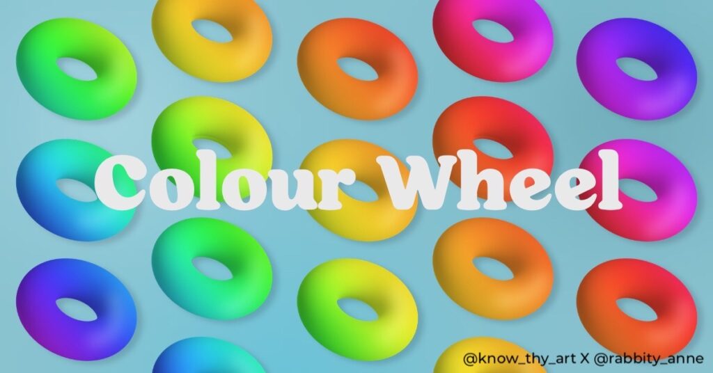
The colour wheel is a visual representation of primary, secondary, and tertiary colours. The primary colours are red, blue, and yellow, while the secondary colours are green, purple, and orange. Tertiary colours are created by mixing primary and secondary colours. A colour wheel is a useful tool for selecting colour combinations that work well together.
What is colour harmony?
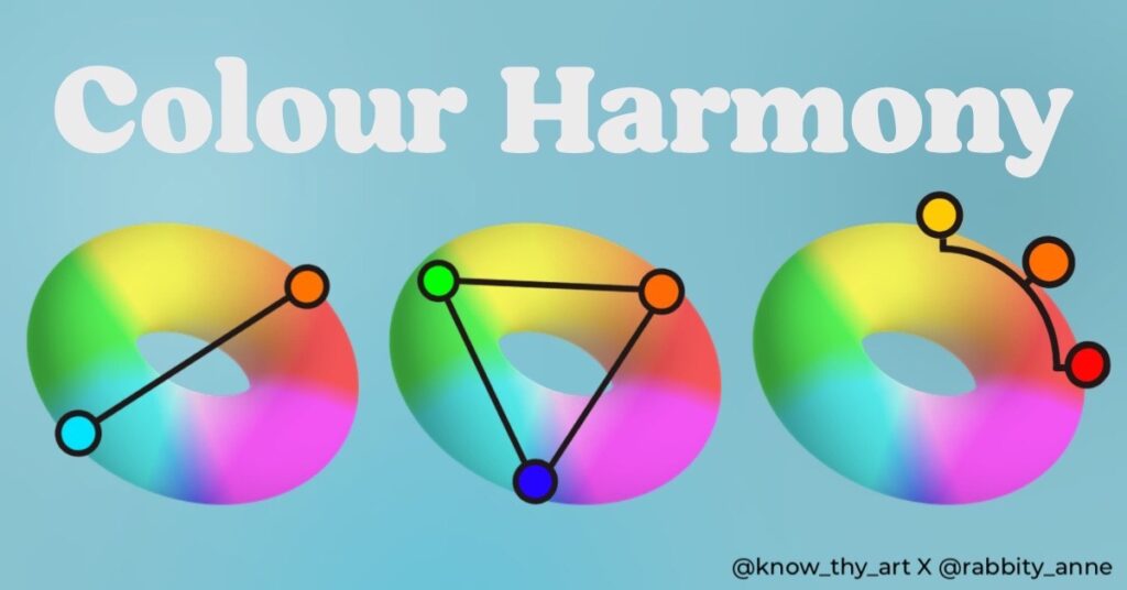
Colour harmony refers to the concept of using colours that are pleasing to the eye. There are several types of colour harmony, including complementary, analogous, and triadic. Complementary colours are those that are opposite each other on the colour wheel, while analogous colours are those that are adjacent to each other. Triadic colour harmony involves using three colours that are equally spaced on the colour wheel in a triangle. Also, the Quadratic or “double complementary” scheme is the palette that forms when you make a square on the colour wheel.
What is colour temperature?
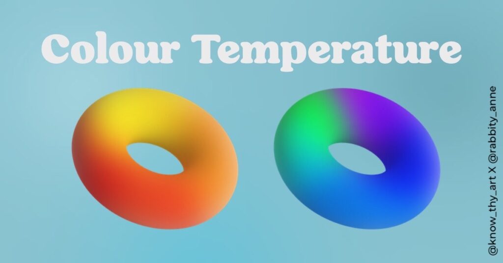
Colour temperature refers to the warmth or coolness of a colour. Warm colours include red, orange, and yellow, while cool colours include blue, green, and purple. The temperature of colour can be used to create a sense of mood or emotion in a composition.
Applying Colour Theory in Your Work
Now that we have an understanding of the basics of colour theory, let’s explore how to apply it to your digital art.
How to choose a colour palette?
When starting a new digital art project, begin by selecting a colour palette. Consider the mood or emotion you want to convey and choose colours that align with the theme, scene or subject that you will draw. You can use the colour wheel to select complementary or analogous colours, or you can choose a specific colour temperature to set the tone for your composition.
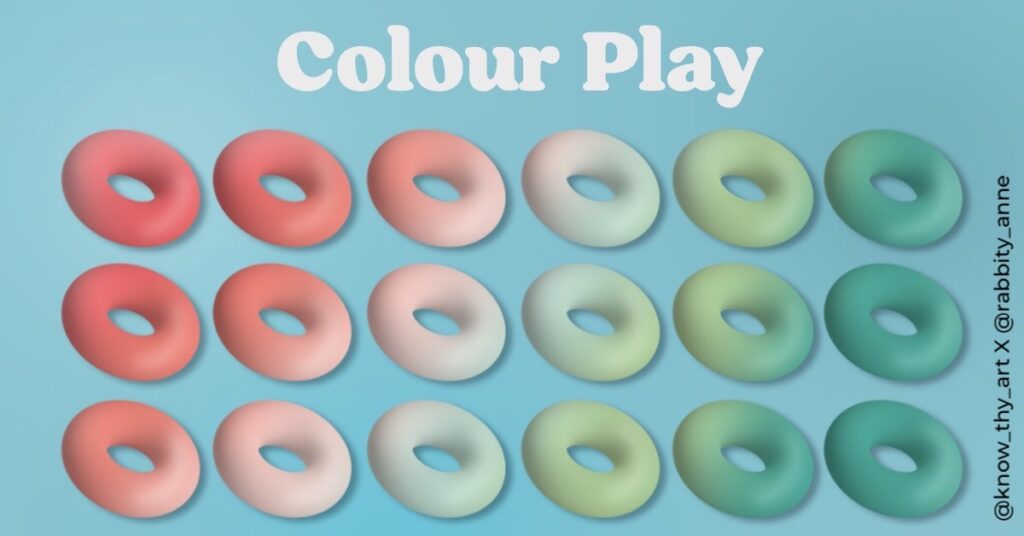
Experiment with Colour Saturation and Value
Saturation refers to the intensity of a colour, while value refers to the lightness or darkness of a colour. Experiment with adjusting the saturation and value of your colours to create depth and contrast in your composition. For example, you can use a highly saturated colour for the focal point of your composition and desaturate the surrounding colours to draw the viewer’s eye to the main subject.
How to use colour to create depth?
Colour can also be used to create the illusion of depth within a composition. By using warmer colours in the foreground and cooler colours in the background, you can create a sense of space and depth. You can also use colour to create a sense of atmospheric perspective, where colours become less saturated and cooler as they move farther away from the viewer.
How to use colour to convey emotions?
As previously mentioned, colour temperature can be used to create a sense of mood or emotion in a composition. Warm colours are often associated with energy, excitement, and passion, while cool colours are associated with calmness, serenity, and relaxation. Use colour to convey the emotions and feelings you want to evoke in your audience.
How to use contrast in colour theory?
Contrast refers to the difference between light and dark colours in a composition. By using contrasting colours, you can create a sense of drama and tension in your digital art. Use high-contrast colours to draw attention to specific areas of your composition or to create a sense of movement and energy. Conversely, colours of lower contrast or lesser difference should be used in places that should not demand attention.
Understanding colour theory and its application in digital art is essential for creating visually appealing and impactful compositions. By choosing a colour palette, experimenting with saturation and value, using colour to create depth, convey emotion, and paying attention to contrast, you can create a visually appealing masterpiece.


0 Comments