
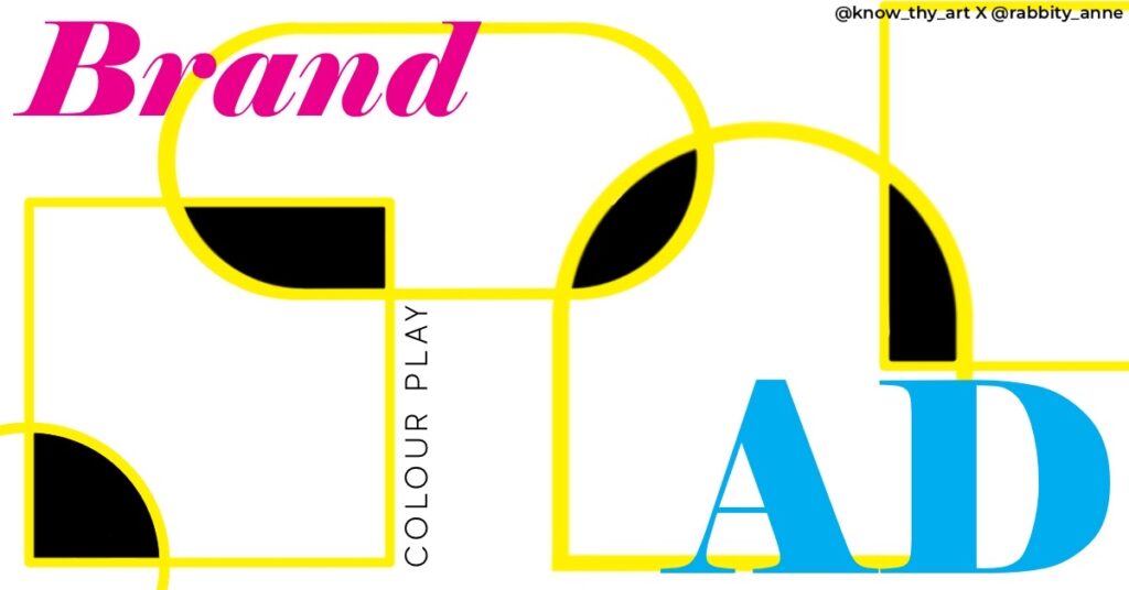
Colour Play is when colour is used at the right place in the right way to bring about the overall visual development of the design project. Colour correction, LUTs, digital effects, photo filters and even curated set pieces, fashion and props of specific palettes are forms of Colour Play. Today, we will take a look at some classic ways in which Colour Play is used in print and digital design to enhance the visual outcome and development of the artwork. Even though we will discuss these as the colour play trends, this list is pretty much full of classics. Or rather, trends that will never go out of style.
Gradients
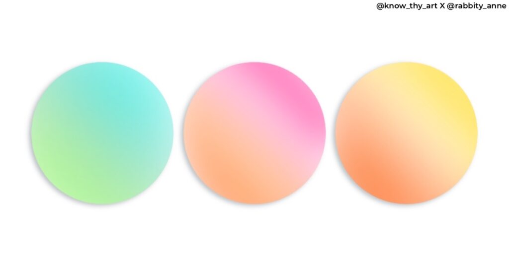
Gradients make designing projects a whole lot easier for branding designers. Every company has their own colour palette. Using each company colour as a gradient makes for a quick-fix background that is pleasing to the eye. Also, a gradient background can make the project attractive without demanding too much attention.
Multicolour Noise
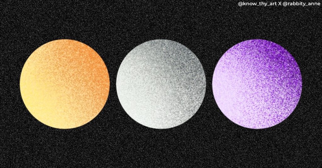
Every digital artist whether a designer or illustrator, will have a “noise brush” that is their handy tool when they need to add texture to their design project. Noise can add character through unassuming texture and even give digital art the “feel” of print. When used right, the noise texture doesn’t just have to be shades and tints of the same base colour. Colour play can be effectively used with a red sphere that has blue noise shading or whatever the project demands.
Monochromatic Grunge
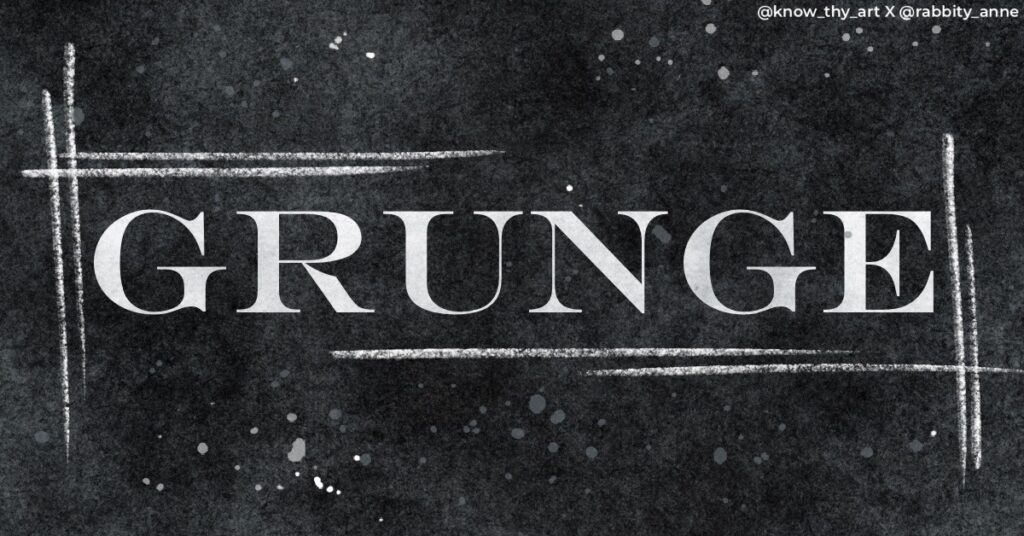
Grunge may have been popular in the 1980s but with a new appreciation for vintage and print, it is back and how. Digital Designers increasingly want their work on screen to have the same effect that retro print projects had. This classic rock texture looks great on projects that demand the use of a desaturated palette. Monochromatic grunge adds depth to the visuals of a design project.
Neutral Play
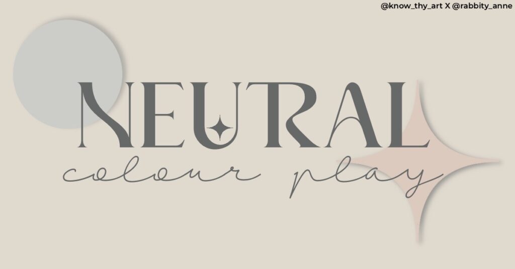
For icon or text-heavy designs, it is always best to stick to simple backgrounds and colours to maintain readability. But, this doesn’t mean that the visual aesthetic has to be boring. Playing with combinations of neutrals is the best way of using colour play to immediately add class and a hint of seriousness to the design.
RGB & CMYK Play
The four CMYK dots on the bottom corner of your newspaper are now a viable colour palette for some companies. No doubt, branding designers tend to tweak the colours a bit to make it fresh but admittedly, it is great Colour Play. The designs pop with a 90s or Piet Mondrain vibe from his “composition with red, blue and yellow” artwork. Simple, yet effective colour play will always be a well-received classic.
Do you have favourite Colour Play trends? Let us know in the comments below.


0 Comments