What is Y2K Nostalgia Design?
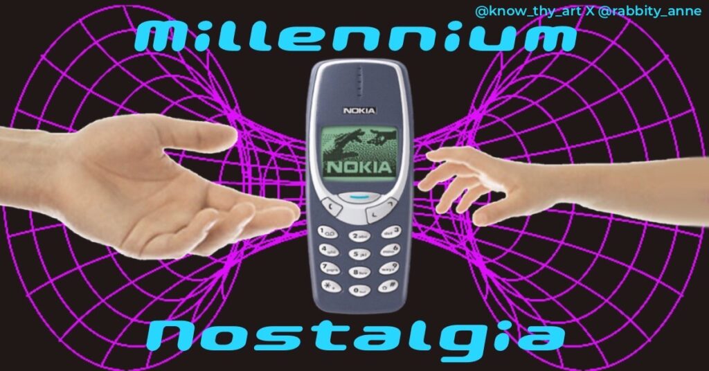
Y2K Nostalgia is a style in graphic design, branding, fashion and motion graphics that are based on the styles prominent in the early 2000s. People in the early 2000s adopted a futuristic style with the hype of the new millennium. Today, the Y2K style is considered a “nostalgic design.”
The same millennium 2000s style today is no longer considered futuristic, rather, it is called the Y2K nostalgia design trend.
What are colour schemes or palettes in Y2K Nostalgia Design?
Palettes of “shocking colours” are mostly seen in Y2K nostalgia design. Graphic artists tend to create palettes of electric pinks and blues with equally loud greens and yellows. Sometimes, embellishments are done using the holographic effect or neon glows.
What are the design elements in Y2K Nostalgia Design?
Things like CDs, Nintendo Gameboy, Nokia mobile phones, and old desktop computers are common elements in Y2K nostalgia design. Basically, things that were considered futuristic in the early 2000s would be ideal elements in this design style.
What are the font styles in Y2K Nostalgia Design?

Typography in Y2K Nostalgia Design tends to have a metallic texture or holographic look to it. Fonts like “Gau Font Pop Magic” and “Dogica” are the kind of font families used in Y2K Nostalgia Design.
What backgrounds and textures are used in Y2K Nostalgia Design?
Gaussian Blurs on gradients, metallic textures, a slight blur with noise to emulate a low print quality texture and holographic colours are common textures in Y2K nostalgia design. In terms of colours, Y2K tends to have what is called the “Vapourwave” aesthetic. It is inspired by the electric music genre. Loud colours like neon purple, hot pinks and electric blues are used with a gradient effect. Every element on the design will also be colourful with pin light shadows of the same electric colours. Ironically, “Vapourwave” is an 80s-inspired aesthetic that started in the 2010s and came to be used in Y2K styles.
To see a full list of these styles see, Top Digital Design and Illustration Styles
What is the layout style in Y2K Nostalgia Design?
The placement of elements in publishing design of the early 2000s resembled a very “scrapbook” style. This is to say that a poster in the Y2K style would look very informal where elements looked like they are cutouts brought together to make one cohesive artwork. A Nokia phone here, a Tron geometric pattern there, a futuristic font here and all wrapped up in loud colours.

What is the creative industry application in Y2K Nostalgia Design?
Younger millennials and Gen-Z tend to prefer this aesthetic over other demographs. In advertisement, fashion or branding design that caters to this audience, using Y2K nostalgia graphic design becomes a viable option. The “mood” of this aesthetic is casual, loud and punchy. This is perfect for companies that associate with such a “brand personality.”


0 Comments