In the history of UI, design was definitely not a priority. In the 1980s, manufacturing better processors and marketing computers to a still sceptical audience were the top challenges. Once processors got better, offices began to see the benefits of using computers. This was a tough challenge that Bill Gates, IBM, Intel and some of the biggest names in tech had to overcome in the 80s. However, once Steve Jobs came into the picture with Apple computers, design, finally got the attention it needed. This is where the evolution of computer User Interface in the 1980s began. You could say that Jobs’ argument was that aesthetics also deserved some work and attention in UI development. Macintosh made UI design pleasing to look at and other tech companies followed suit. But before this happened, let us take a look at what the UI was like, before it was all dressed up in design.
Colourless, Mousless
The first home computers did not have colour screens. The text and icons were mostly neon green on a dark background just like the aesthetic of the Tron films. Because there were no colour choices, it was difficult to show hierarchy in format. Headers and body text were hardly too distinguishable on computers in the 1980s. Furthermore, these computers did not have developed mouse capabilities. Even when it had the finger mouse, movement on the screen was mostly restricted to 4 directions. This means that arrow keys navigated the user to the right option and the “enter” button was used to select. It was only later on that users could click on buttons with a mouse. Design principles of computer UI in the 1980s were based on the availability of input devices.
8-bit Icons
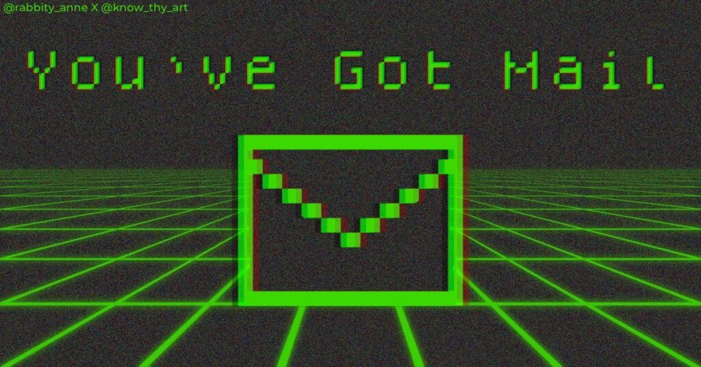
Since computers had just one colour to work with, 8-bit icons did not have additional line art, the icon itself was just line art. Icons were rarely used but when there was an icon, the art was obvious and “to the point” like iconography should be. A little bin for “delete”, a little envelope for mail and other standard jagged-edged icons were the UI design of the 80s.
No Shadows, No Highlights
Even though there was just one neon-green colour, there were no hues or lightness to it. This meant that any icons, characters or images were flat. Even in the 1990s when colour screen computer monitors became popular, images were still flat. The “bubble effect” on buttons and icons with dimensions came much later. In other words, computers were meant purely for the purpose of completing a task and not really about enjoying the process. UI design, in a way, made computers fun to work on.
Pixel-edged Fonts
The history of UI design – 1980’s, tells us that having multiple fonts was not really a thing on old computers. You essentially work with what you get. The lines were absolutely straight and the curves were pixelated like 8-bit. As long as it was legible, it was good. However, the fonts looked futuristic as compared to Times New Roman from newspapers.

What do we think about the history of UI design 1980s?
Maybe the design elements from the history of UI design in the 1980s might seem rudimentary today. However, it went on to inspire the aesthetic of the 80s. The UI retro, cyber-punk style even became popular with films like Blade and Tron. Because of nostalgic design, designers are reviving the vintage computer UI of the 1980s. Web Designers today can focus on making browsing a beautiful experience. This is probably because the developers of the past focused on making processors better. You could say that we are riding on the backs of giants.
The 80s era has made a spirited comeback in User Interface design, with a resurgence of 80s retro UI design ideas and trends. Designers are embracing the retro look, infusing websites with a vintage style reminiscent of the vibrant 80s. These retro website ideas take you back to an era known for its bold colours, geometric shapes, and futuristic aesthetics. By incorporating elements like neon palettes, pixel art, and vintage typography, designers are creating visually striking interfaces that evoke a sense of nostalgia while remaining fresh and captivating to modern audiences. The revival of 80s retro UI design is a testament to the enduring appeal of this iconic era in design history.






0 Comments