Gestalt Principles of Design essentially combine the merits of design and psychology to create visuals that are coherent to the viewers. These principles provide valuable insights into how our brains perceive and organise visual information, helping designers create cohesive and impactful designs. In this post, we’ll break down the Gestalt principles of design in simple terms with famous examples.
What are the Gestalt Principles of Design?
The Gestalt principles of design are a set of psychological theories that explain how humans perceive and organise visual elements into meaningful patterns. The word “Gestalt” itself translates to “shape” or “form” in German. Gestalt Principles focus on the perception of patterns and final outcomes.
Figure Ground
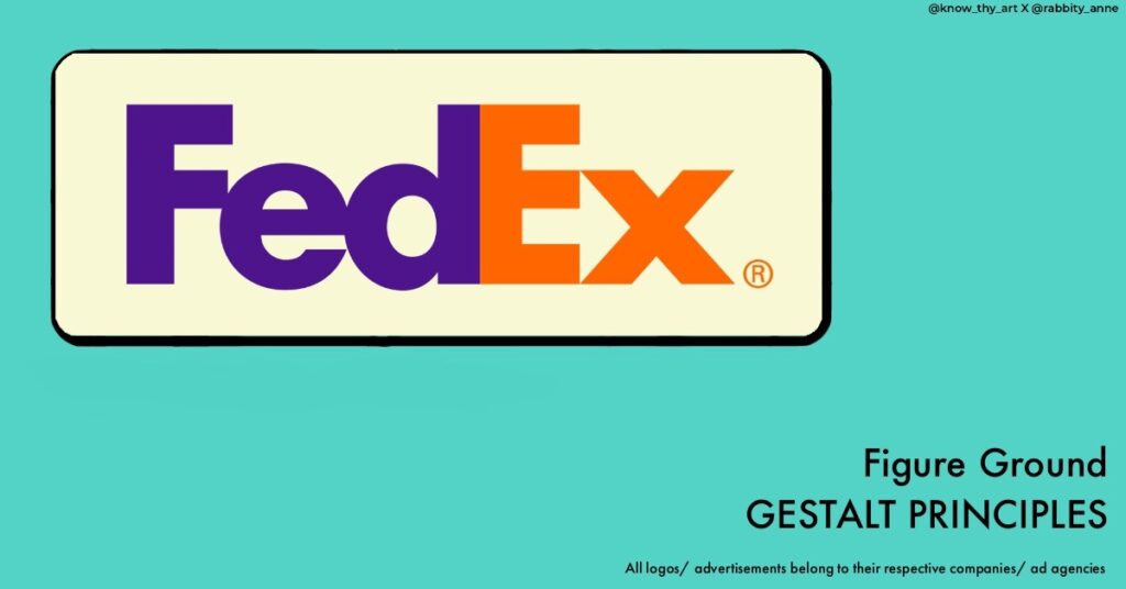
The Figure Ground principle explores how our minds distinguish between a main object (figure) and the background (ground) in a composition. In other words, the background image and foreground object complement each other. For example, the arrow embedded between the “E” and “x” in the FedEx logo
Proximity
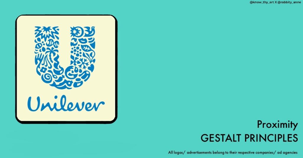
This principle states that objects placed close to each other are perceived as a group or related elements. If you place three circles together, they are perceived as a single unit rather than separate circles. For example, the proximity of elements forms the “U” shape in the Unilever logo.
Similarity
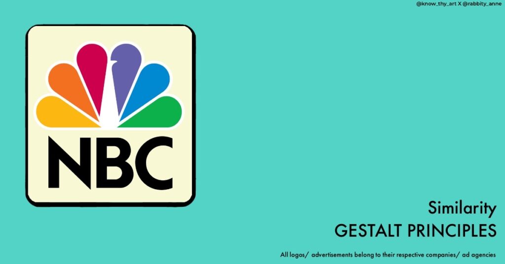
Similar elements are perceived as related or belonging together. If you use the same colour or shape for different objects, our brains group them together, creating a visual association. For example, the similarity of petals is cohesive to form the peacock shape in the NBC logo.
Continuity
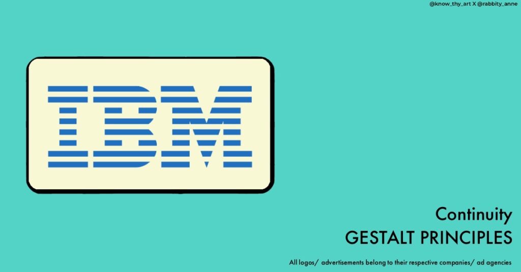
Our brains tend to see continuous and smooth lines as a single object. In that sense, when elements of fixed characteristics like same colour or weight are used continuously, the brain automatically assumes the elements are continuous. For example, the continuity of lines form the letters in the IBM logo.
Closure

When presented with an incomplete shape, our minds tend to fill in the gaps to perceive a complete shape. This is why we can still recognise an incomplete circle as a circle. For example, the panda in the WWF logo is not completely drawn and yet your mind fills in the white areas of the bear.
Symmetry and Order

Symmetrical designs are perceived as more organised and harmonious. Our brains instinctively seek balance and order in visual compositions. For example, the symmetry and order of the rings in the Olympic logo.
Common Fate
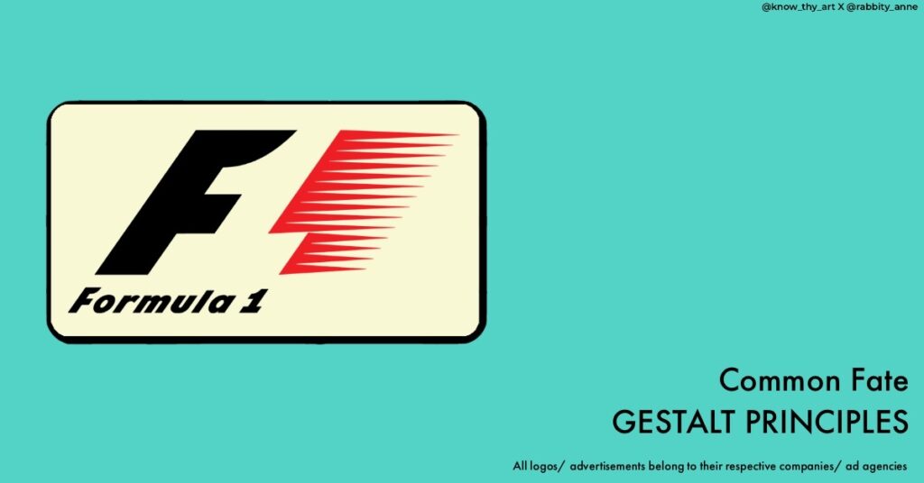
Elements moving in the same direction are perceived as a group. This principle is often used in animations or designs involving movement to create a sense of correspondence. For example, the feeling of movement in the old Formula 1 logo. Here the “1” is formed in the negative space between the “F” and the movement lines in red.
Past Experience
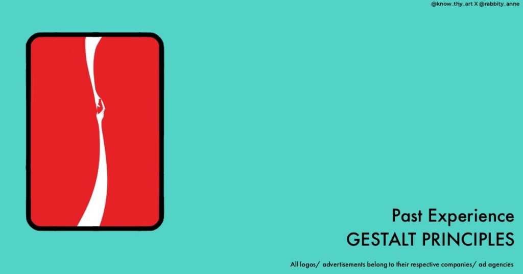
Our previous experiences and cultural background influence how we perceive visual information. Designers can leverage this principle by incorporating familiar symbols or images to convey specific meanings. For example, advertisements of some companies like Mcdonald’s, Nike and Coca-Cola are so familiar to audiences that even minimal imagery is enough for the viewer to recognise the brand.
How to use Gestalt Principles in Design?
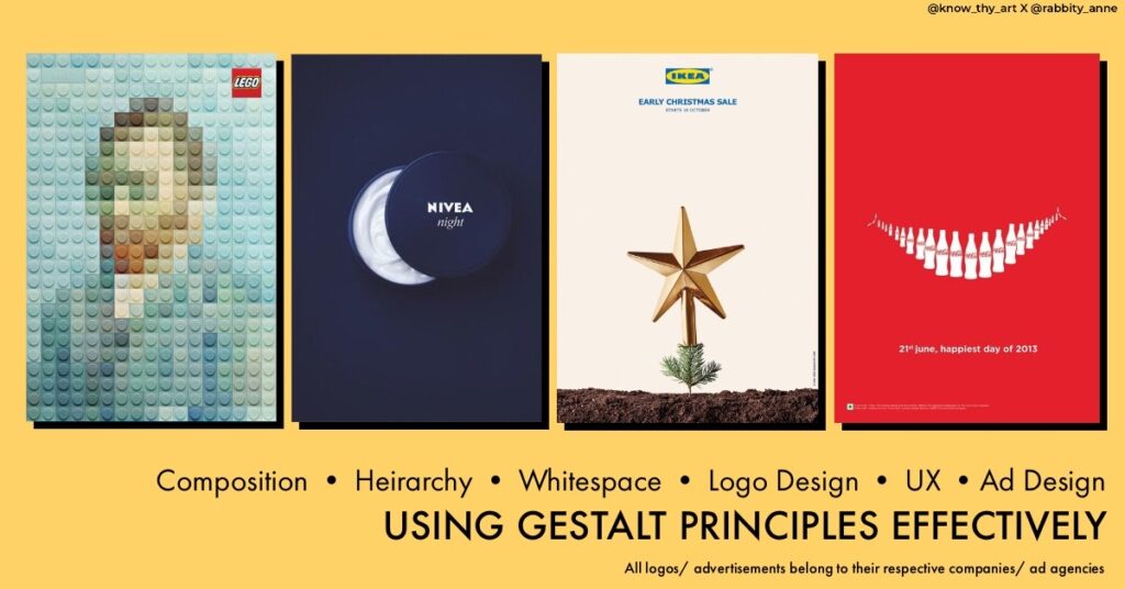
Understanding and applying Gestalt principles can significantly enhance your design work. By grasping how people naturally perceive visual information, you can create designs that are not only visually appealing but also effectively communicate your intended message.
Let’s explore some practical applications of these principles in design:
Composition
Using the principles of proximity and similarity, you can organise elements in your design to guide viewers’ eyes and create a sense of unity. Placing related elements close together or using consistent colours helps establish visual relationships.
Hierarchy
Applying the principle of order helps you create a clear hierarchy in your design. By arranging elements symmetrically or using common fate to group related items, you ensure that viewers easily understand the importance and flow of information.
Whitespace
Gestalt principles emphasise the importance of negative space. Proper use of whitespace enhances figure-ground perception, allowing your main elements to stand out and grab attention.
Logo Design
Creating memorable logos often involves applying closure. A cleverly designed logo can use incomplete shapes to encourage viewers to mentally complete the missing parts, making it more memorable.
User Experience (UX) Design
Gestalt principles play a crucial role in designing user interfaces. By considering common fate and continuity, UX designers can create intuitive navigation and interactions that guide users seamlessly through a digital experience.
Advertising
Advertisers often leverage the principle of Past Experience. By incorporating symbols or imagery that trigger familiar associations, they quickly convey messages or emotions without extensive text.
In essence, the Gestalt principles of design provide a foundation for creating visually compelling and impactful designs. We can understand how our brains perceive and organise visual elements. Whether you’re designing a logo, a website, infographic or an advertisement, incorporating these principles can elevate your design work to a new level of creativity and effectiveness.




0 Comments