Designing a book cover is an art form that marries creativity with technical skill. Book cover designs, whether created using Adobe InDesign or other software, are a canvas for ideas to come to life. Book cover design is a world plot narrative and design merge. This offers endless possibilities for striking visuals. For those seeking inspiration, there are book cover design templates that provide a creative launchpad. And, with free book cover templates available, designing is accessible to all.
Online tools and specialised software make the process smoother, ensuring that your book’s cover is not just a protective layer but a work of art that entices readers. Brilliant book cover designs are a great inspiration for creating your own book cover. Let us explore some incredible book cover designs.
Look who’s back – Timur Vermes
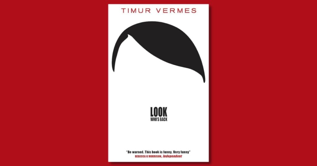
Cover by Johannes Wiebel
Johannes Wiebel’s book cover design for “Look Who’s Back” by Timur Vermes is a masterstroke of visual storytelling. The cover perfectly encapsulates the novel’s satirical premise, where Adolf Hitler mysteriously returns to modern-day Berlin, and the results are both humorous and thought-provoking.
The cover features a bold, larger-than-life portrait of Hitler, his iconic moustache and hairstyle. This stark representation serves as a striking commentary on the enduring presence of this historical figure in our collective memory. It cleverly juxtaposes the past with the present, forcing the viewer to confront the unsettling idea of Hitler in contemporary society.
The choice of font for the book’s title, with a bold, uppercase, sans-serif typeface, adds a touch of modernity and irony to the design. This contrast between the old and new is a central theme in Vermes’ novel, and Wiebel’s design captures it brilliantly.
What’s remarkable is how Wiebel’s design manages to be simultaneously provocative and darkly humorous, much like the book itself. It sets the tone for the novel, inviting readers into a world where satire and social commentary intertwine. This cover is a testament to the power of book design in conveying the essence of a story and intriguing potential readers with a single image.
Don Quixote De La Mancha – Cervantes
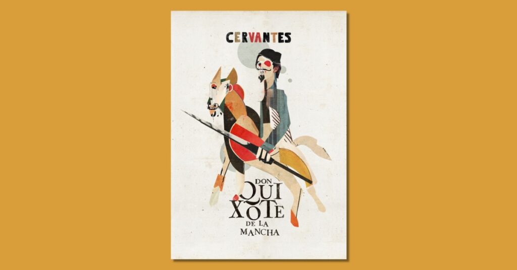
Cover by Christos Kourtoglou
Christos Kourtoglou’s book cover design for “Don Quixote de La Mancha” by Cervantes is a stunning representation of this timeless literary masterpiece. The cover pays homage to the chivalrous and imaginative spirit of the novel while capturing the essence of the characters and adventures within.
At the forefront of the design stands the iconic figure of Don Quixote, mounted on his trusty steed, Rocinante. This striking image encapsulates the spirit of a man who, in his delusions of grandeur, saw himself as a gallant knight in a world of his own making. The use of bold, vibrant colours, especially the rich blues and reds, evokes the vivid landscapes of Spain and the fiery determination of the novel’s protagonist.
The book cover design is almost in the cubism style that Pablo Picasso was known for. Cubism in art looks like a chaotic representation of otherwise simple figures and scenes. Quixote on his horse is a fairly common illustration. However, the cubist aesthetic gives it a complex look. This is not unlike the plot of the book. An average person dreaming of being a hero can be an ordinary story. However, the complex situations illustrated in the book give the book a unique characteristic.
This book cover design gives the readers a glimpse of the diverse and often absurd situations that make up the novel. In sum, Kourtoglou’s cover design for “Don Quixote de La Mancha” is a visual ode to the novel’s enduring charm, capturing its humour, adventure, and timeless relevance. It invites readers to embark on a journey with the ingenious gentleman from La Mancha, making it a book cover that honours Cervantes’ literary masterpiece.
The Teleportation Accident – Ned Beauman
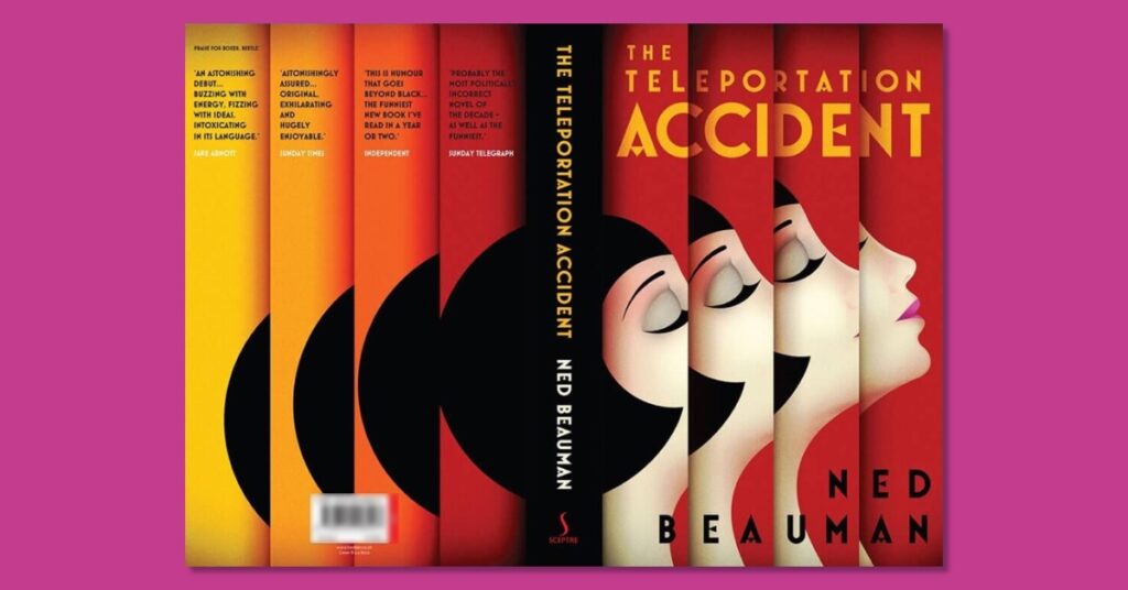
Cover by Scot Bendall
Scot Bendall’s book cover design for “The Teleportation Accident” by Ned Beauman is a mesmerising blend of art and intrigue. The cover serves as a visual gateway to the novel’s peculiar and imaginative narrative, perfectly capturing its unique essence.
At first glance, one is drawn to the cover’s striking centrepiece—The face of a woman that seems to appear fully with each frame. This is to highlight how a person who teleports would gradually appear to be fully present at their destination. It’s an allusion to the novel’s exploration of the strange and unexplainable, as well as the protagonist’s journey through space and time.
The typography is equally captivating, with the title elegantly crafted in a retro, art-deco-inspired font. This choice pays homage to the book’s historical setting in 1930s Berlin and its themes of avant-garde art, eccentric inventors, and theatrical escapades.
Bendall’s design is not just a cover but a visual invitation to step into a world where reality blurs with the surreal. It perfectly encapsulates the novel’s spirit of curiosity and adventure, making it a book cover that not only draws readers in but also piques their curiosity, mirroring the novel’s own sense of wonder and discovery.
Psycho by Robert Bloch
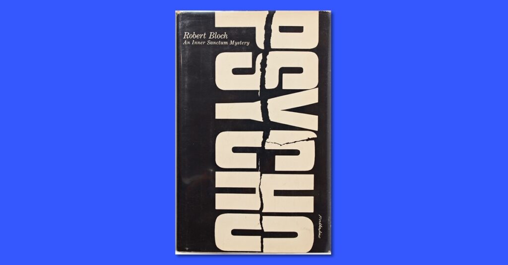
Cover by Tony Palladino
Tony Palladino’s book cover design for “Psycho” by Robert Bloch is an iconic example of how a single image can evoke spine-chilling horror. Palladino’s design has become synonymous with the novel’s suspenseful and psychologically disturbing narrative.
The cover features a haunting and enigmatic illustration of the word “Psycho” in large, bold letters. What makes this image so chilling is its unsettling perspective, and a crack right across the middle of the word., creating an overwhelming sense of dread. This distorted visual perspective is a perfect representation of the character Norma Bates and his “split personality.”
The choice of stark black and white, along with the eerie font for the title, further heightens the sense of foreboding. The elements add a jarring contrast, hinting at the violence and suspense that awaits within the pages.
Interestingly, Palladino’s design came at a time when graphic and typographic experimentation was emerging in the world of book covers. His cover for “Psycho” took a bold departure from traditional book design and contributed to the shift towards more artistic and expressive covers in the industry.
Palladino’s cover design for “Psycho” has transcended time, becoming an integral part of the novel’s legacy. It serves as a chilling reminder that the most effective book covers are those that capture the essence of the story and leave an indelible mark on the reader’s psyche.
Laser Writer 2 by Tamara Shopsin
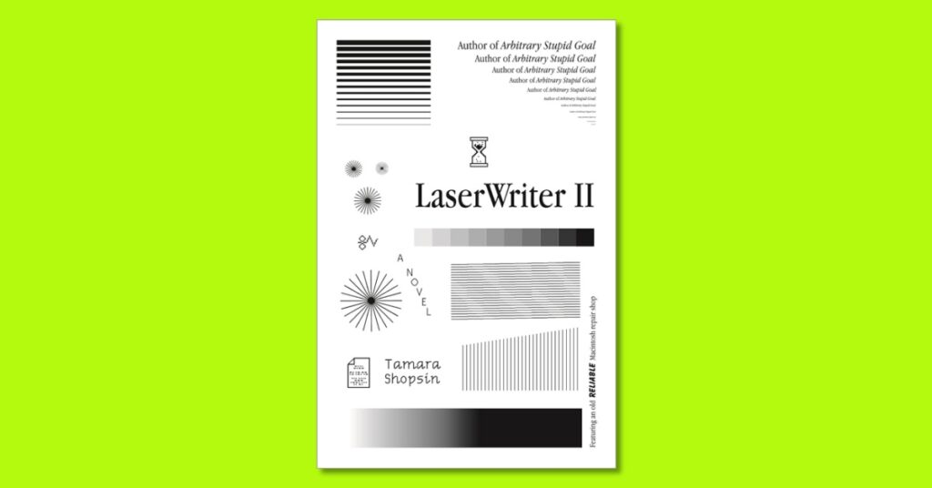
Cover by Tamara Shopsin
Tamara Shopsin’s book cover design for “Laser Writer 2” is a vibrant and playful reflection of the unconventional nature of the book itself. The cover exudes an energy that’s immediately engaging, mirroring the lively and eclectic content within.
The design features a dynamic collage of graphics, illustrations, and typography that meld together in a delightful visual cacophony. It’s a whirlwind of chaos and shape, evoking the feeling of flipping through a sketchbook filled with whimsical ideas and doodles. The central focal point is the title, “Laser Writer 2,” rendered in a bold, retro, and slightly irregular font that adds to the book’s overall charm.
What’s particularly captivating about Shopsin’s design is its ability to encapsulate the spirit of experimentation and creativity that runs through the book. “Laser Writer 2” is a collection of essays, comics, and musings on various topics, and the cover acts as a visual prelude to the unconventional narrative that awaits readers inside.
The book cover is a testament to the power of design in conveying the essence of a work. In this case, it doesn’t just represent the content. The cover becomes an integral part of the storytelling. It does so by capturing the author’s distinctive voice and the delightful unpredictability of the book. Shopsin’s cover is a vivid and captivating introduction to the world of “Laser Writer 2,” inviting readers to embark on an artistic and intellectual adventure.


0 Comments