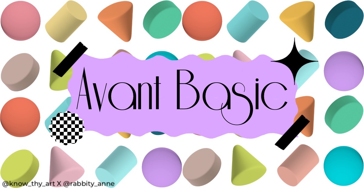
The word “Avant” means “original” or “innovative” in French and the word “basic” means “simple” or “ordinary.” This is why the “Avant Basic” design style is a merger of contradictions. It follows the design principle of “contrast” and yet somehow the result is harmonious.
Avant basic is a style of Interior Design that is a perfect blend of minimalism and maximalism. This design trend combines the principles of less and more seamlessly to form a setting of many bright colours, basic patterns and shapes but with flat finishes of less or no textures, no highlights or shadows. Avant Basic is made popular by Gen-Z kids in response to overly minimalistic styles that tend to have less or no “personality.”
Recently, Avant Basic has transcended from Interior Design to Graphic Design and even UI Design. Now that you know what Avant Basic Design is, let us learn its characteristics and how to use this design style effectively.
Pastel Pop
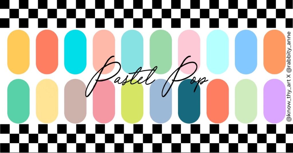
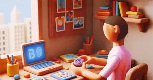
Avant Basic designs mostly use bright colours that are either pastel or just bright and slightly desaturated. Whenever these colours are used, there will usually not be gradience and the design elements and even the furniture will lack any texture. The elements will have a minimalist smooth surface and the object will have bright colour blocks.
Pattern Play
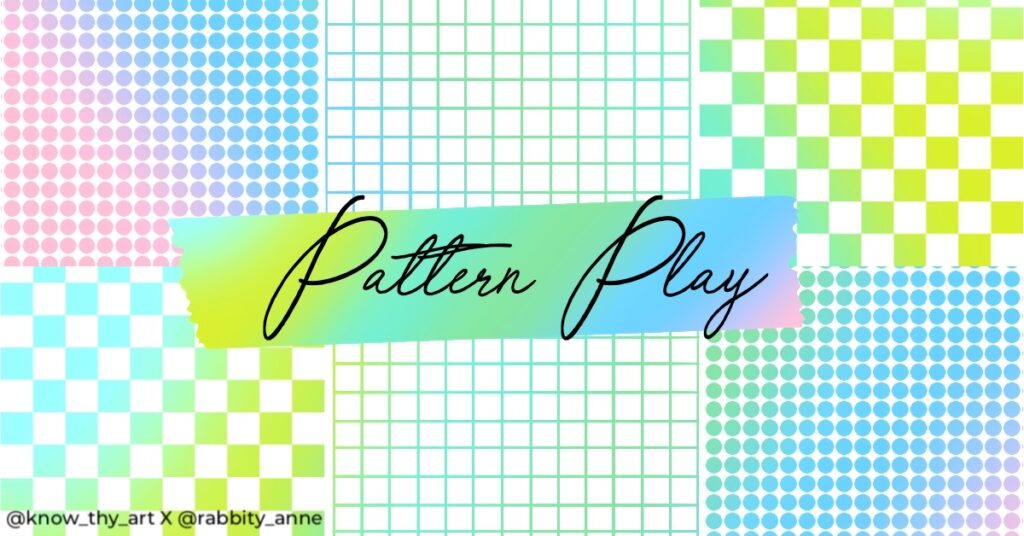
Think of the most basic checkered patterns, squares, spots or even standard stripes like Kate Spade. These basic patterns are usually used in either black and white or in a bright Avant Basic colour. Colour palettes would depend on the design harmony with the surrounding elements and the overall aesthetic of the project. Using the warp or liquify tool in Photoshop, you can easily make the squiggly shapes that Avant Basic is known for. The intricate patterns or rough textures are mostly never used in Avant Basic design projects
Basic Shapes
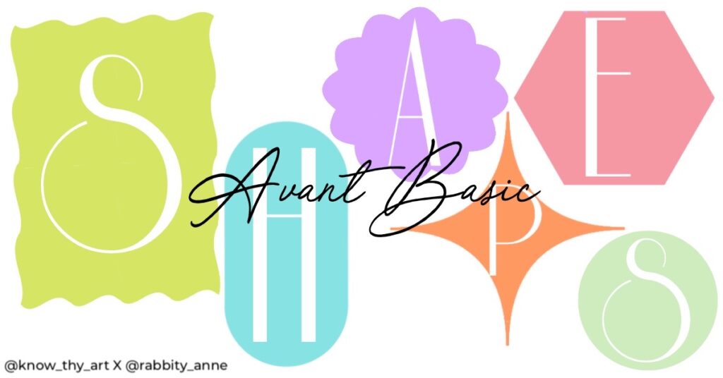
Diamond stars, window shapes, squiggly squares and solid daisy shapes are what you will see in Avant Basic projects. Even furniture and frames used in Avant Basic interiors are likely to be squiggly squares that almost look like it is something out of a toy box. In graphic design and UI, Avant Basic elements mostly include such shapes as squiggly squares and diamond stars. Drop shadows are mostly not used as the saturated colours offer enough contrast for distinction among elements.
Play around with colours, patterns and shapes along with an application of the 12 principles of design. Soon enough you could master the Avant Basic design style for your next design project.




0 Comments