What is 90s nostalgia design?
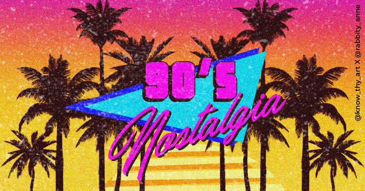
90s nostalgia graphic design is a trend that has become increasingly popular in recent years, particularly in graphic art and branding. This style is characterised by its use of bold, bright colours, playful typography, and retro-inspired imagery, particularly from the 90s.
Colour Palette or Colour Scheme 90s Nostalgia Design?
Bright pastel colours with increased saturation are popular palettes for 90s nostalgia graphic design. This makes the colours look like a cross between pastel colours and shocking neon colours. The bright, playful colours that came in the Crayola box are generally seen in 90s Nostalgia Design
What are the design elements for 90s Nostalgia Design?
Icons that became famous in the 90s like the smiley face, dotted textures, animal prints on hot pink backgrounds, checkerboard and squiggly noodle lines are seen in the 90s aesthetic. Moreover, design elements in the 1990s tend to have bold, black outlines. If there is no outline, then the imagery is likely to resemble Risograph prints. The imagery will generally include 90s elements like cassette tapes, rollerblades and boom boxes.
What are the Font Styles for 90s Nostalgia Design?
Typography of the 1990s can be characterised as being mostly “playful.” Fonts had rounded corners, novelty bubble fonts, type with solid drop shadows were popular in graphic posters of the time.

What are the Backgrounds and Textures for 90s Nostalgia Design?
Light dust effects, worn-out effects like on old photographs from the 90s, glitches, noise and even a little grunge are the textures used in 90s graphic design. All this, along with the use of saturated colours makes the overall 90s aesthetic pop.
What is the Layout Style for 90s Nostalgia Design?
While the layout in graphic design and publishing art of the 90s depended on the project itself, you can still find common themes. Layout for posters had one hero image at the top and centre with the headline below or decorated around the image. Fine print was mostly presented as slugs in the corner of these posters. This typical layout of 90s nostalgia graphic design allowed the images and text to have a cohesive hierarchy.
What is the Creative Industry Application for 90s Nostalgia Design?
Since Millennials and GenZ grew up in the 90s, any brand that caters to this demographic would do well to adopt this style. 90s nostalgia graphic design tends to have a happy and funky feel to it. If this suits the “brand personality” and it goes well with the products and advertisement messaging, then adopting this style is clever.


0 Comments