Every film has that one main poster that is released as the initial promotional material. Later on, producers release singular characters in the spotlight, these are called “Character Posters.” The film poster design trends can go on to become iconic and even case studies in graphic design, illustration and photography classes. A film like Alfred Hitchcock’s Vertigo was famous for its design and silkscreen printing technique. Rob Marshall’s Memoirs Of A Geisha is iconic for its monochromatic photography with the pop of colour from the red lips. These designs held meaning to the plot of the films in a subtle yet evocative way.
Since film posters are the first thing that the audience sees, movie poster artwork and its impact on cinema are massive. Movie poster artwork and its role in film marketing are the same as the relationship between an advertisement and a product.
Fast forward to 2022 and the movie posters we see today. Movie poster artwork styles and trends, techniques and materials may have changed but its impact still remains. Let us take a look at the photographic elements, illustration, graphic design, layout and art direction of the movie posters of the top 10 blockbuster movies of 2022.
Film Poster Design Trends
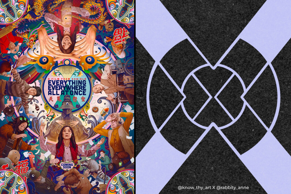
Everything Everywhere All At Once
Studio: A24
Starring: Michelle Yeoh, Jamie Lee Kurtis, Ke Huy Quan
Director: Dan Kwan, Daniel Scheinert
A maximalist storyline calls for a maximalist layout. The poster of this film is circular with outer ring layers. Each level or layer is full of colourful illustrations and photos of characters from the films. A truly refreshing poster in a Maximalist style.
This poster goes to show that illustrators, graphic designers and directors of photography can work together to create a masterpiece full of meaning to the film and its concentric storyline. And above all, the poster doubles as a prop for a drinking game I would like to call “spot the googly eyes.”
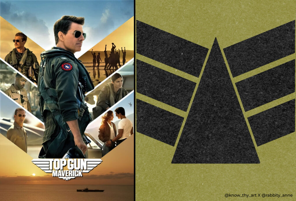
Top Gun: Maverick
Studio: Paramount Pictures
Starring: Tom Cruise, Jennifer Connelly
Director: Joseph Kosinski
The layout of the Top Gun: Maverick poster cleverly resembles an aviator wing patch that is sewn on a pilot’s jacket. The layout looks like a remastered version of the old Top Gun logo from the 80s. The poster has a good colour scheme that is evocative of the sky with its blue and yellow hues. The lead actor is perfectly centered to look like the body of an eagle (since it is an American film) and the rest of the cast becomes his wings. All elements are translated well into a recognisable geometric shape of the classic Top Gun logo. This is a good example of when a clever design layout can make the rest of the graphics look like a neat narrative.
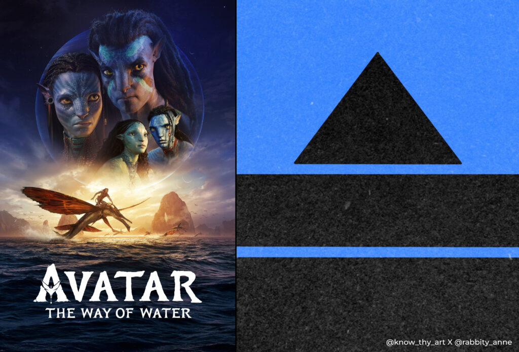
Avatar 2 – The Way of the Water
Studio: 20th Century Studios
Starring: Sam Worthington, Zoe Saldana, Sigourney Weaver
Director: James Cameron
Since Ryan Gosling has already joked about Avatar and Avatar 2 using the papyrus font for its main title, I will not go further into it. The layout design of this poster is quite ordinary with the main characters’ heads in the sky in a typical vignette fade-out. Yellows and blues are merged well but the subject and composition don’t particularly stand out as much as they could have for a fantasy film of Avatar’s calibre.
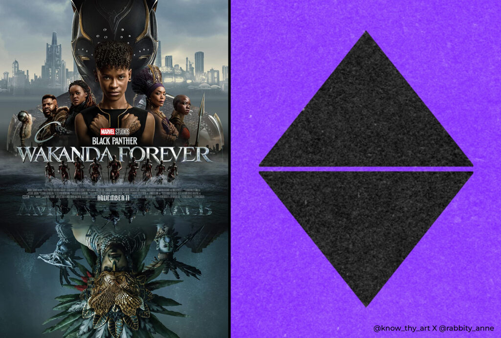
Black Panther 2 Wakanda Forever
Studio: Marvel Studios – Disney
Starring: Letitia Wright, Danai Gurira, Angela Bassett
Director: Ryan Coogler
Marvel Studios usually put all of the main cast together in a cluster, they blur out the edges of their floating heads so it can look like the characters blend together. They give the poster a colour scheme, generally, something in the colours of the superhero’s costume, slap on the title and voila! The Black Panther Wakanda Forever poster is no different. However, this time the layout is cohesive and indicative of the characters’ backgrounds in the story. The Namor and Talokan people are depicted as a water reflection of Shuri and the Wakandans. Overall, this is a good poster that aims to capture the plot details of the film.
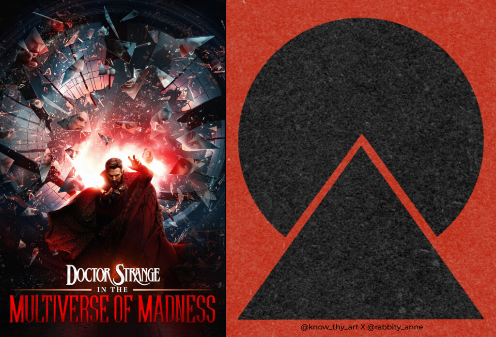
Doctor Strange in the Multiverse of Madness
Studio: Marvel Studios – Disney
Starring: Benedict Cumberbatch, Elizabeth Olsen
Director: Sam Raimi
Shattered glass pieces show the destruction of the multiverse with versions of Dr. Strange reflected in some of them along with other main characters. Not bad for a Marvel poster. However, after so many films of Marvel’s 4 phases, the studio should aim to go beyond “not bad.” The Doctor Strange comics and fan art have some brilliant concepts using halftone, inky comic illustrations and colours. As far as posters of multiverse movies go, Everything Everywhere All At Once has a fantastic poster in comparison. Paying tribute to these pulp artists and illustrators in the posters might be a better way to honour them and please the fans. Here’s hoping Marvel makes better work for film poster design trends.
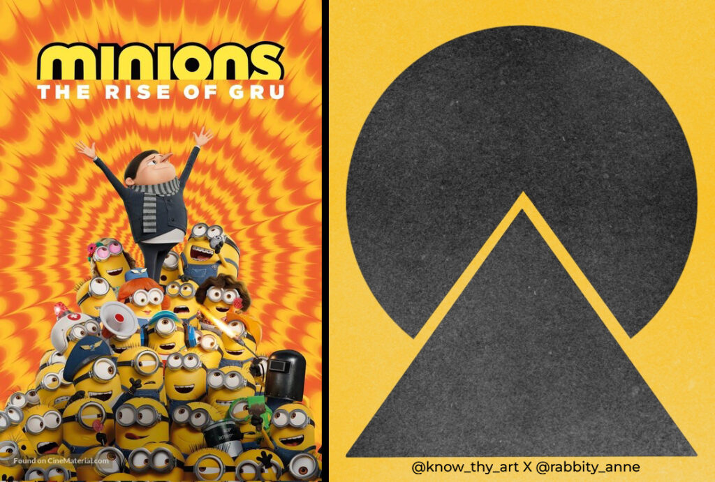
Minions: The Rise of Gru
Studio: Illumination
Starring: Steve Carell, Julie Andrews
Director: Kyle Balda, Brad Ableson, Jonathan del Val
Tie-Dye! What’s not to like? Even though Minions: The Rise of Gru poster has the same layout as Doctor Strange And The Multiverse Of Madness, the former may have done it better. The film poster design trend is full of fun colours as a kiddie film poster should be. The concept cleverly uses tie-dye and Op Art as a nod to the 70s since that is the time frame in the plot. Also, Gru is at the top of the minion pyramid to show his leadership of them. Altogether cheerful, clever and succinct concept design.
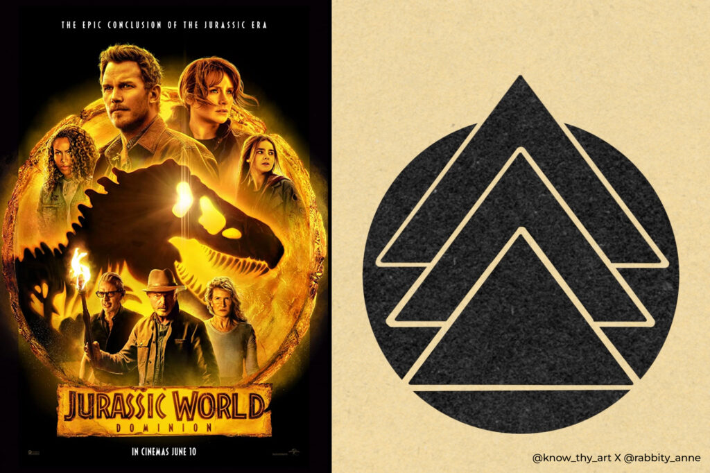
Jurassic World: Dominion
Studio: Amblin Entertainment
Starring: Chris Pratt, Bryce Dallas Howard, Jeff Goldblum
Director: Colin Trevorrow
The Jurassic World: Dominion poster has three layers that hint at three phases of the story that come together. The original team of the original Jurassic film and the new team merge for a common cause in the middle triangle – The dinosaur. The T-rex in the middle is the icon from the original film’s logo with the rising sun in its eye. This might emphasise the new dawn of a world with dinosaurs.
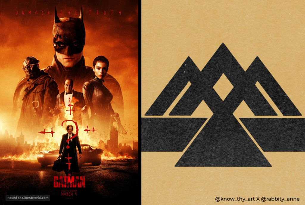
The Batman
Studio: DC Films
Starring: Robert Pattinson, Zoe Kravitz, Colin Farrell
Director: Matt Reeves
A Riddler target on Bruce Wayne. Sure the question mark is the Riddler’s icon but the poster does a good job of using it to depict Bruce Wayne’s questionable identity. The layout, in a way, also looks like a swooping bat. The poster manages to highlight everything it needs to for the sake of the film’s narrative.
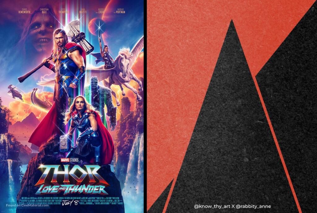
Thor: Love and Thunder
Studio: Marvel Studios – Disney
Starring: Chris Hemsworth, Natalie Portman, Christian Bale
Director: Taika Waititi
While the cliff-shape layout isn’t much to write about, the strong holographic colours, chromatic aberration and loud colour scheme are quirky and attractive. This suits the vibe of the recent Thor films. For collectors of 80s art, this poster can be a good addition.
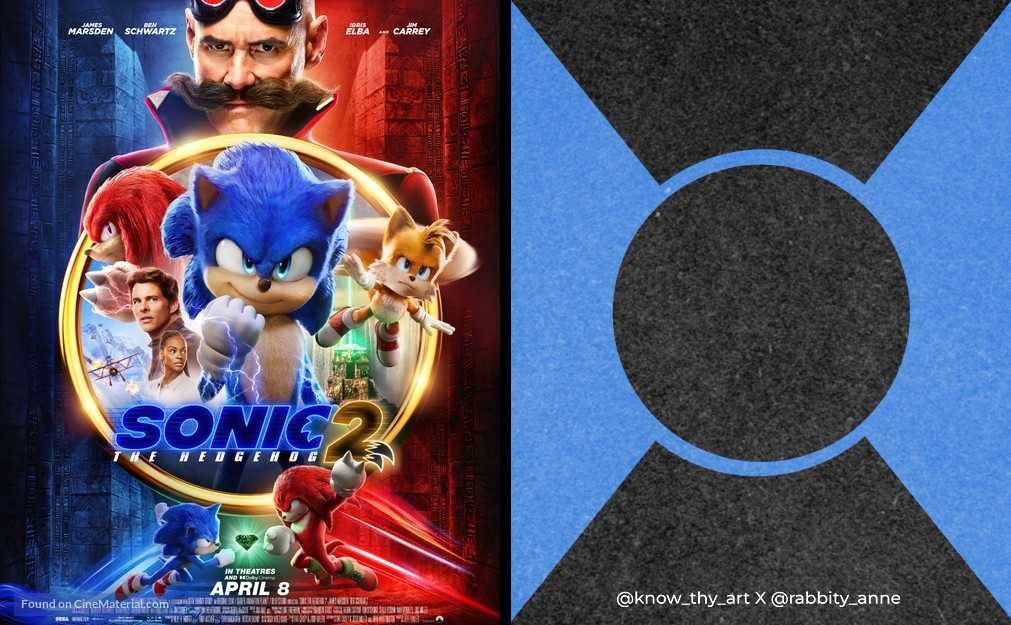
Sonic The Hedgehog 2
Studio: Paramount Pictures
Starring: Jim Carrey, James Marsden, Ben Schwartz
Director: Jeff Fowler
The iconic gold ring from the Sonic games, a neat layout, the opposing colours of the hero and villain, and a bit of lightning and neon light effects across the characters in the poster. Formulaic but in this case, if it ain’t broken, don’t fix it. This is one of the clever film poster design trends. A fun poster of a fun children’s film based on a fun video game that doesn’t look like it is taking itself too seriously.




0 Comments